El Croquis Head Office
The objective was to create a flexible building, in the case of a living publishing house, which must adapt to new requirements.
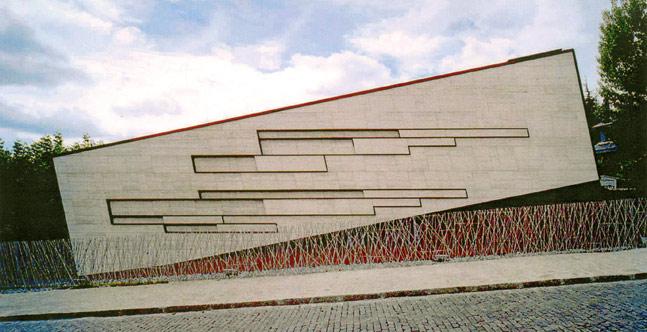
The strict regulations of the neighborhood in relation to the height of construction and the obligatory use of sloping roofs became the leitmotif that generated a restless volume that gradually began to move.

El Croquis magazine is one of the most prestigious architecture publications in the world.
The architects Fernando Márquez and Richard Levene, its creators, have edited and directed the magazine since 1982. In 1999 they inaugurated the «El Croquis Architecture Gallery», as a place to exhibit the most significant projects under construction in the new headquarters of the editorial El Croquis, a building designed by both architects.
Being their own clients, they faced the project with great freedom and responsibility, fully aware that their project can be judged, taking care of everything from the program to the materials.
The project elaboration process lasted a year and two more of construction. In that time the studio grew and part of the program was changed. The peculiar idiosyncrasy of the architects in relation to the indeterminacy and ambiguity in the uses, desires and priorities acted as a liberating factor, allowing the program of needs to be questioned and kept open, not compartmentalizing the spaces at each level and inventing new uses during the long project process and execution.
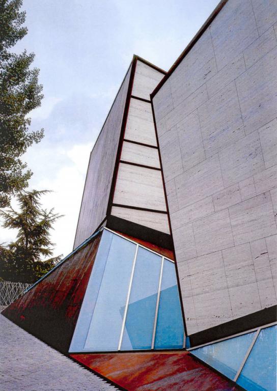
The original idea to use a flat roof was ruled out by the strict regulations. Instead, the building was tilted and placed on the embankments. The volumes sink into the ground. The two emerging prisms, finally provided with a sort of sloping roof, rest on a series of planes that move in turn, on the edge of two abstract granite fluids that descend parallel to the transverse direction of the site, stitching the artificial topography slopes and emphasizing the pedestrian and service access roads.
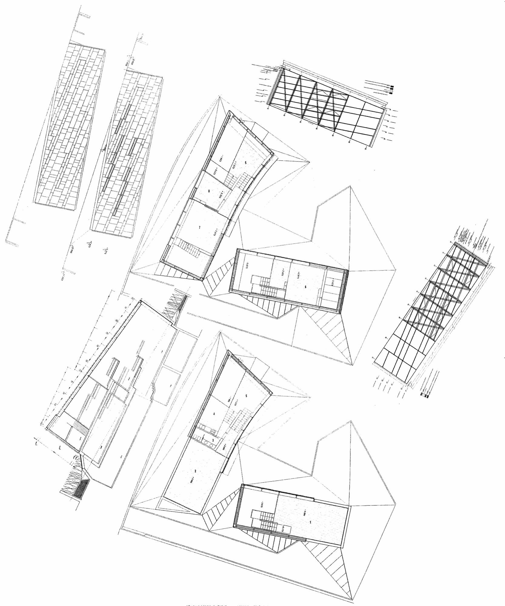
The building is made up of two blocks forming an L shape, connected on the ground floor. Initially, one block was used as the editorial and the other as a gallery. However, in practical use the two blocks remained absorbed by the publishing house, using the ground floor as a gallery, or conference room where discussions or debates can be organized. This is the flexibility needed in the program.
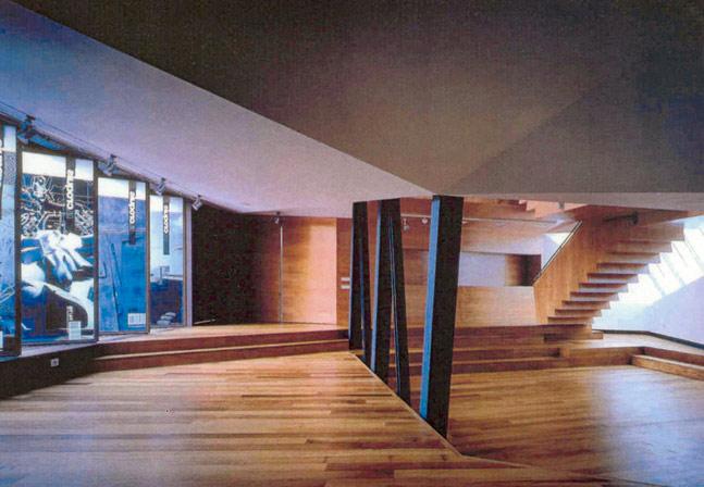
Given the residential nature of the neighborhood, it was decided to make a building whose interior was larger than it appeared from the outside, in order to respect the context. Externally it follows the alignments and heights of the area, but inside, the building is spatially larger using double and triple heights.
The building consists of spaces of different character, although well interconnected, each of them being independent.
The two blocks are open their facades to the garden. The volume of the Gallery has translucent glass, unlike that of the Editorial, which is transparent. These enclosures, determined by the amount of sunlight and the desired degree of luminosity, soften the light or highlight certain perspectives.
The solution adopted in the façades provides the building with a solid foundation, a certain iota of maturity that it needs as the headquarters of one of the best architecture magazines in the world.
The prisms cover their opaque faces in Roman travertine marble and iroko wood.
The inclined planes are made of corten steel and laminated glass.