The Long Room Hub at Trinity College
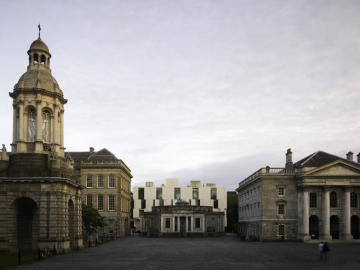
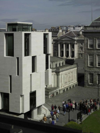
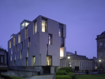
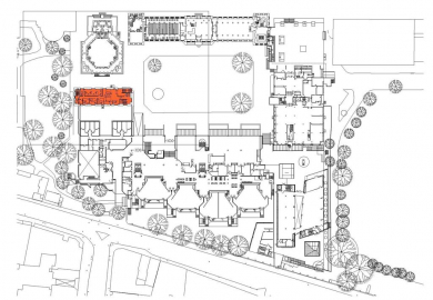
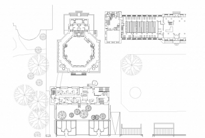
The Long Room Hub is a building for research and thought, a modern space taking account of the haphazard, the natural, in a way that mimics the synapses of the brain. The building found the site and not vice versa. The University has the character of rectilinear planar stone volumes defining intimate squares. Routes leak out at corners, axial views, crabwise circulation. The Old Library formed one side of a 20th century square; its west end was unresolved. Sitting astride the roof of a sunken lecture theatre, the Hub was located here. It is literally a bridge, a steel truss linking two supporting cores, provisional rather than rooted a weighty thing paradoxically light and floating: the impossible lightness of ideas. It judges its height against the Old Library, creates a backdrop behind the diminiutive 1937 Reading Room to scenographically close Front Square, piled up rooflights breaking the skyline as cupolas, gazebos, chimneys .
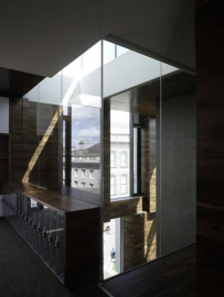
The section reflects the concept - four floors of accommodation in a disciplined section; entrance level with its staff offices, first floor seminar rooms, two upper levels of research and reading. It establishes rhythm in a three dimensional matrix holes through one, two or three floors, starting at the eroded entrance void. Two cuts are external, a third is a stepped atrium void, the fourth the ideas space through third and fourth floors.
Sustainability affects all aspects of this architecture. Located on an historic campus, critical to the history of Ireland, it is sensitive to its particular context In shape, height and materials, sustaining the cultural imprint of the location. It was sustainable to make an infill project in the city, with established transport nodes. Services routes were well- established throughout the university. Located on a 1970s lecture theatre, the site was borrowed and required minimal site preparation. The University used a District Heating System, removing the requirement for a large new plant area.
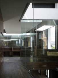
The concept was tied to sustainable principles in its architectural character. It is thin in shape and substantially naturally ventilated, using the stack effect in atria. The main orientation is North- South. Windows are relatively small on each elevation, with recessed zones creating deeper shaded areas. Its position minimizes solar gain, the South elevation substantially shaded by adjacent forms- residual gain excluded by low e double glazing and blinds. Light levels are high with light cannons oriented in different directions, adding to the interest and complexity of light patterns. Core materials were from renewable resources.
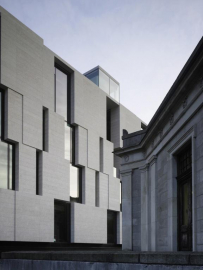
In an urban landscape of stone, this newcomer echoes the force of natural rock, hewn, fractured, a cliff split through with light. The granite is biscuit-crisp; the honeycomb surface is broken and imprecise; the envelope forming recesses and external spaces. A modified Fibonacci sequence of proportions 1, 1-2-1, 1-3-3-1 - runs in storey height bands. Internally the depth is extended by rich timber linings like a walnut glove. Cuts pin the volumes together, becoming the landscape around which the functions operate.

