Clapham Manor Primary School
dRMMs intervention into a Victorian Board School, completed July 2009. A polychromatic extension inserted into a tight urban context offers the school a new identity, much-needed learning spaces, an organisational hub whilst maximising play space.
The School had become a victim of its own success; pupil numbers doubled placing considerable pressure on successful delivery of curriculum within the restrictions of
the original building. dRMM was asked to consider the provision of learning spaces to support both learning and play. The new wing conceived as a freestanding addition
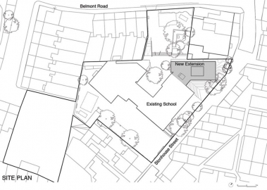
plugs into the Victorian School, an architectural pace maker that reactivates the host building and achieves the best form of sustainability, the continued use of an existing building.
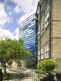
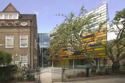
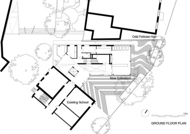
The new wing is pulled away to sit parallel with the neighbouring Grade 2 listed Odd Fellows Hall. The resultant interstitial space establishes a formal entrance - a triple
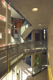
height transparent atrium that separates new and old. A glazed lift and stairs that scissor overhead connect four new storeys with three Victorian levels.
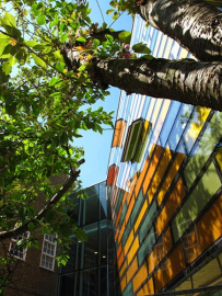
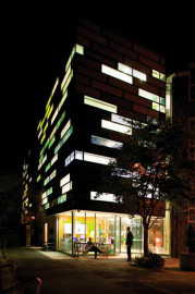
The architectural intent was to create a contemporary building sitting shoulder to shoulder with the two great brick exemplars. The glass façade is inspired by post war schools, but benefiting from advances in technology and thermal performance. The formal grid that typically defines curtain walling is replaced by an offset grid to provide a relaxed expression, appropriate for a primary school.
The building appears without scale as the façade conceals clues to storey heights - it is contextualised through colour rather than composition. The façade is a polychromatic loop of colour that shifts as it moves around the building. The contextual brick colours inform the rich reds and yellows along Stonhouse Street. The colour spectrum shifts into greens as the building emerges on the playground side, echoing soft landscaping below, and finally into vibrant sky blues.
In addition to classrooms, pupils benefit from spaces for performance, music and breakout learning. The informal, social spaces that connect the classrooms are vibrant and stimulating, eliminating corridors and offering visual transparency. Staff benefit from a staff room, resource room, administration, and offices.
INTERIOR
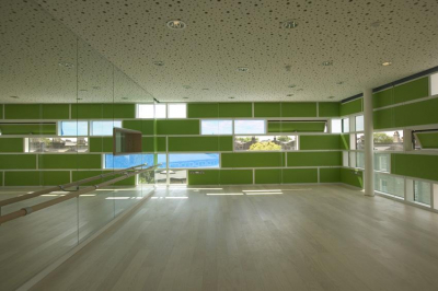
The facade works doubly hard to define not only the exterior but also the interior. The vibrant coloured glass panels are upholstered internally allowing for the display of pupils work and enhanced acoustic absorption. In contrast the classic criticism of glass walls, staff are actively encouraged to adorn these walls. Solid (insulated), fritted and clear panels at varying heights create amazing compositions of the urban landscape and are inclusive of all ages. The three panel façade system is composed to maximise benefits of solar gain, provide solar shading and offer excellent daylighting. Environmental requirements for acoustic absorption, lighting and mechanical ventilation offer delight with ceilings composed as random arrangements of circular
holes, lights and diffusers. An ultra quiet atrium is achieved by lining the walls with acoustic plywood to mimic the plasterboard ceiling above. The space is animated by a
glazed lift with exposed mechanism as educational delight for pupils to behold.

 copy.jpg)
 copy.jpg)
