Rehazenter Luxembourg, National Functional Re-education and Rehabilitation Centre (CNRFR)
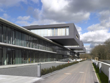
The design of the Rehazenter (Centre National de rééducation fonctionnelle et de réadaptation) was largely influenced by the functional constraint and the form of the land.
The services offered by the Rehazenter are as well for stationary patients (72 beds) as for ambulant patients (250 per day). A treatment for all kind of lacks needing re-education and rehabilitation is offered.
The building, accessible everywhere for disabled people, needs larger horizontal zones and an adapted infrastructure.
Vertical connections should be used as less as possible. This functional concept and the stretched land determine the conception of the project.
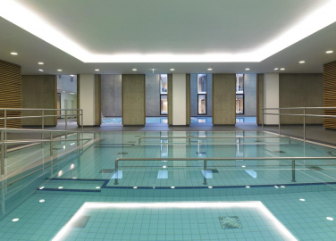
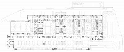
On the garden level, orientated to the valley, are situated the therapy zones : sports, physiotherapy, hydrotherapy, kine- and ergo therapy as well as the zone called professional re-education for the reintegration into professional life.
The public functions, orientated to the exterior, are situated on level 0, the ground level.
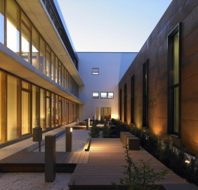
Among peripheral vertical surfaces of glass, the therapy zones are enlightened and ventilated through four internal yards, all treated in a different manner. The sports hall and the semi-Olympic basin are integrated in the concept of the yards and the building volumes; the principle of the room in the room applies here. The volume of the basin put in the second yard is covered with corten steel.
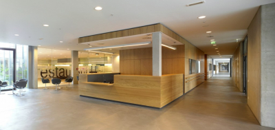
Auditorium, training rooms, restaurant and management are organized around the main entrance on level 0. Direct visual relationships exist between those zones and the volume of the sports and the swimming area. Connected to these rooms, further from the entrance, are located the administration, the medical rooms, medico-technical rooms and the communicative and relational services.
The second conceptual element is the circulation, which like a backbone holds the volume over the whole length and creates an access to the different zones as well horizontal as vertical.
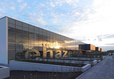
This volume finds its dynamic through the different treatments of the façades. The one orientated to the public area in the North is structured with a horizontal aluminium belt and offers views from the interior to the exterior as well as from the exterior to the interior.. The opposite façade is treated as a hole façade. The multiple openings in the architectural concrete allow a limited glance into the therapy zones.
The third conception element are the three stationary departments on level +1, built as boxes laying on the therapy plate and piercing the circulation area.
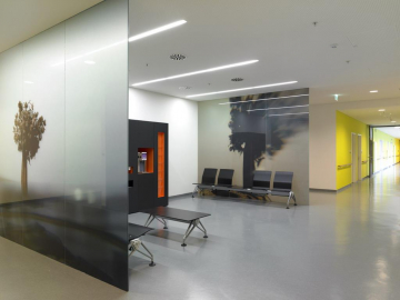
All rooms are designed with warm materials and colours (dark floors and furniture, black plates) and are foreseen to make a stay of several months as agreeable as possible.
In all public areas we find architectural concrete, industrial pavement and steel elements.
An agreeable natural note is given by the window frames in oak and the wooden oak floors in the hospitalization and the large therapy rooms.

