Parkside Living Vienna
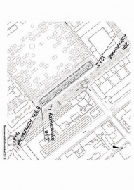
The remarkable dimensions of the project provoke a series of universal architectural questions: What should a large building look like without seeming monotonous or vast? How might qualities of recognition be created both inside and outside, how can identification with the whole be provided for each individual? The spatial configuration itself, the careful design of a complex algorithm based on a very small number of standardized parameters seems an appropriate method for answering such questions that favours NOT BEING NEUTRAL within mass production. A total of 274 apartments and the associated common spaces were realised for GESIBA with public funding from the City of Vienna.
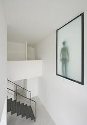
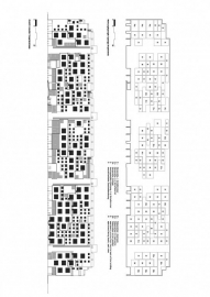
In order to avoid a dark and monotonous central corridor, apartments running from the front to the back of the building divide the circulation into 22 separate parts at selected positions, each with its own characteristic spatial and natural light configuration. These subunits are pragmatic fire compartments on the one hand, but at the same time form small neighbourhoods inside the building.
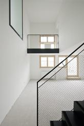
Recognizable places and situations are generated: the double height space in front of the entrance door, the row of columns within the widening corridor, the snapped-off corridor towards the northern facade with view! The internal subunits are designed to be unique places, each different from the neighbouring one.
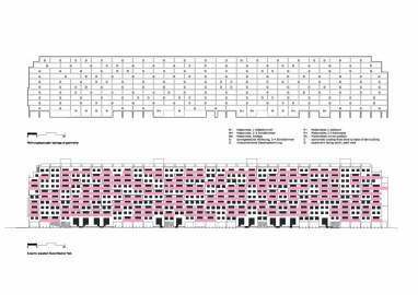
The proposed layout with 274 flats on 10 storeys does not follow a single typology but sounds out the characteristic potentials of the place. Each flat is privileged by its position in the building, either defined by a special view, its orientation towards south or north or its relationship to immediate neighbours inside the building. All south-facing flats have an unrestricted park-view, apartments facing north are maisonettes, compensating the less privileged position with additional spatial quality (gallery+void, double height room), the flats placed between the 4 staircases stretch from the back to the front of the building. The central corridor becomes spatially (3D!) extended wherever possible and offers a semi-private interior space for the residents.
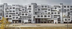
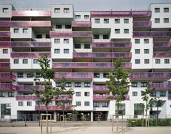
With the façade we avoided clear edges at the park and the street side. The building reveals its internal organisation, the flat typology and the development. One can read the internal concept from outside. Large-scale openings towards the north (maisonettes) in comparison to the conventionally sized windows towards the south give the impression of a building that does not clearly state its true scale: it appears to be smaller / larger depending on the side you are approaching.
The technical and material characteristics remain within the framework of social housing.
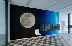
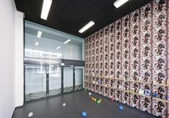
A top class art project curated by Li Tasser transforms the circulation area into a vertical art gallery. 22 artists produce up to 40m2 sized art pieces, all printed on special textiles applied to the walls later on, each designed for a very special location within the building.
The unconventional context of a public housing complex is inspiring for all participants: client, architect, curator, artists and last but not least the residents themselves.

 copy.jpg)
 copy.jpg)
