Triplex Residential Complex
The architecture in Karlsbad substantially changed during Romanticism, Eclecticism, and the Art Nouveau eras. Yet the original, more-or-less medieval town structure of tower volumes on narrow sites has been preserved. The thing is that this building method was the most efficient in respect of founding, erecting, and municipal utilities in this rather complicated terrain. So, thought it is not obvious, Karlsbad is a city of towers.
The TRIPLEX residential complexŽ concept tries to exploit both the attractive location and the poetic, yet also pragmatic building tradition of Karlsbad.
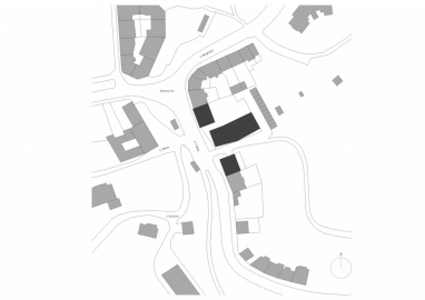
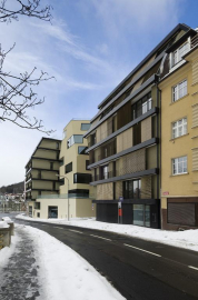
The site in the broader spa city centre providing breathtaking views and adjacent to the park was slit by an easement of passage and entry to the park. The gap length would in fact match four lots in the original urban scale. To occupy it by one compact volume would not match the beat of Praská street. Moreover, the space would be divided in to the in front and behind the house. This way would be established a street and backyard façade each of them offering only limited views or contact with an otherwise attractive environment.
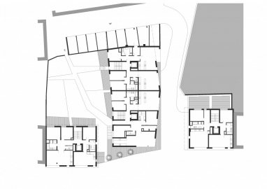
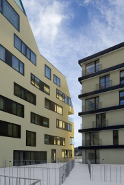
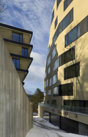
This is why we decided to divide the virtual gaps build up in three volumes. The side volumes align with the gable walls of the existing neighbouring buildings. The central volume is rotated straight to the street front reaching deep in the lot. There runs a preserved service road along this volume.
This composition made the lot airy and lighter, offered more façade and thus also a more intensive contact of flats with the natural environment. Divided volume also provided us with an opportunity to work with separated matters as if they were high-rise towers following the local building tradition.
Separating the building in three volumes allowed also better scaling; so, no matter the composition made lighter and the petty scale of the street front respecting the adjacent buildings utilisation is more effective than it would be if the gap was built up with a compact structure.
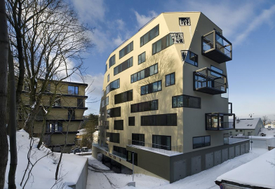
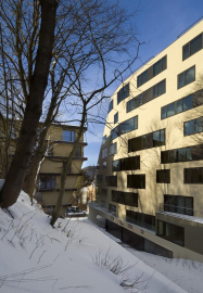
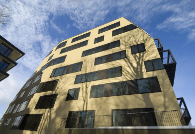
In order to make the split of one building in three clear and persuasive, each part is different. The side structures leaning to the gable walls of the existing houses are more fragile. They are composed of panels lapping over each other, creating a feeling of additive architecture with fragile details of shutters, balustrades and structured plaster. On the contrary, the central section is a compact monolith moulded in a sculptural manner. Its solid mass established a pedestal with the streetscape floor and a garden in which rest two towers. From the street we perceive its lower part; from the distance it rises up as a rock tower.
Structure: The first and the third building: a concrete frame combined with brick work, the middle building: cast-in-situ wall system.
Site: 1877 m2, building: 1401 m2

 copy.jpg)
 copy.jpg)
