Office building Latvijas Krajbanka
Headquarter buildings are the most demanding design objects in large scale because they have to represent the client in a long term and bring the long term message to the community, partners and competitors about the owner or business housed.
Financial corporations and banks are one of the most demanding clients since people in most cases will judge them to be strong or weak, reliable or not from the character recognizable in their buildings.
Latvians used to see Krajbanka as stable, conservative entity with long term investment abilities, low risk business and as one of the most reliable banks in region.
When setting the task for architects the Board of the bank was strict no experiments, obvious stability and modernity till understandable limits.
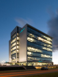
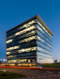
As first idea we presented no other drawings except A3 page with simple square and short explanation 4 is historically the most stable number and the square brings the same message which can be turned in three dimensions as cube at the same time loosing no stability. The proposal was accepted with no further discussions as an idea, which, among many others, ideally represented the philosophy of the company.
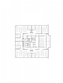
Further it was turned into mentioned cube as the symbol of stability and at the same time ideal for internal planning. The centre of the cube houses the most important functions for building with satellite functions around in specific hierarchy functions with external communications in lower floors, functions with strictly internal importance on the upper levels.
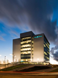
The cube is enveloped by soft, seemingly endless graphical line representing flow of life within which the cube sits comfortable.
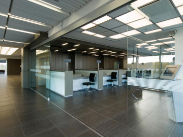
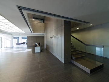
The same line is represented in public interiors of the building. Line follows or leads us from the first floor public vestibule to bank branch, then through atrium to the second floor private services area. Further we can follow it to the third and fourth floors specific consulting areas and to upper Board floor. Interior is kept in simple and representative style with no extravagant exceptions in private areas.
Internal planning solutions are combined open space type which asked for strong ability from administration side to introduce such an approach to the bank clerks. In fact, open space is still new invention in our region and in most cases first opinion is negative, nevertheless within just a few months people find it very convenient and friendly if professionally maintained and managed throughout time, not just well designed.
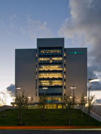
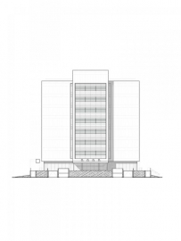
Cast-in-situ concrete line works as a perfect contrast for transparent glass cube with external pattern slightly reminding dice as part of the game financial organizations are playing.
Outside territory of the building is solved taking into consideration basic condition the building represents it by itself and no cars are able to park in front of it or even in places where they might be associated with the set environment.
In front of the building is set big group of birch-trees forming peaceful and representative atmosphere in patio intentionally arrogantly lifted up.

.jpg)
.jpg)
.jpg)