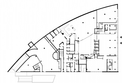
Administrative Building Alpha
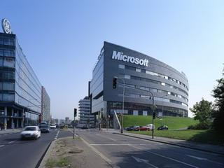
The administrative building ALPHA is located in the middle ring of the city of Prague, on a territory of old warehouses and construction sites; at present, other modern administrative buildings are also located in this area.
The team of STUDIO A won the architectural competition for ALPHA, and the building was designed in 1993 according to the studios urban plan. The intention of the urban plan was to restore the city structure in a location where it had been destroyed by communications infrastructure in the 1960s-80s.
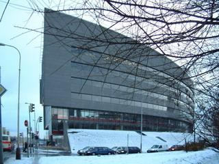
The concept of the ALPHA building (more so than that of other buildings in the area) is greatly influenced by large-capacity communications5. kv?tna street with its exit ramp has a decidedly highway character, and its sharp-angled intersection with Vysko?ilova street, which is at a different level, creates an empty space typical for intercity communications. The buildings interaction with the highway was a defining factor in the search for its form. A part of the building is found underneath a green escarpment, which forms a link between the varying heights, contours of the building, and the exit ramp of the highway.
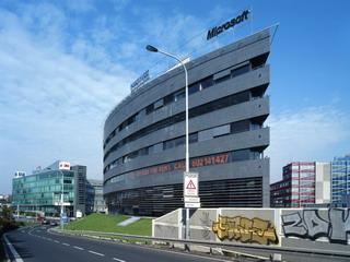
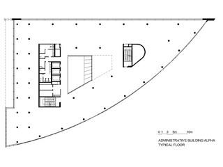
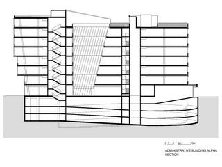
ALPHA is the smallest building on the premises. Like other buildings on the premises, it is predominantly a universal office building with a shopping floor. The concept of the building is such that where possible, it should allow for the creation of a regular city landscape, i.e., a street. Its shorter side, as well as the main entrance, face Vysko?ilova street. The operational hinterland is located on the top floor of the building, as is the terrace and the rooftop garden. The rooftop garden is more than just a quantity of green space required by the administration; it is a space for relaxation among funny coniferous trees. The underground parking, a spiral without ramps, solves all parking.
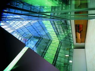
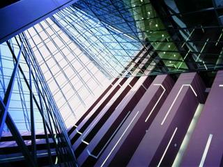
The central yard, which lits up the interior of the building, was designed with experience from the neighboring C building in mind, where due to the unexpected behavior of tenants we lost some of the space (originally there were empty communication areas alongside the yard, which the tenants closed by putting up additional glass).
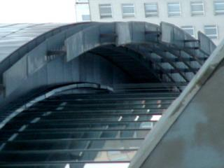
The skeleton of the building is made of regular iron concrete, with the exception of slanted columns enabling a gradually movable north facade. The facade, which forms the portal of the building, has a more complex crystalline construction toward the renewed street. The other two facades with horizontal windows are clad with boards made of intentionally irregular titanium and iron plates in an essentially flashing manner. More regular boards made of the same material were used only in the corners of the facades.
In interior design, we concentrated on the main entrance hall, yard with a cafe and dining room, and on common areas. Offices, which are for rent, are conceived as universal empty spaces, to be adapted by each tenant.

.jpg)
