Office+Production Building
system industrie electronic ag
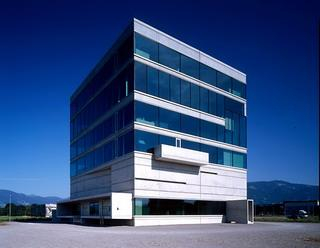
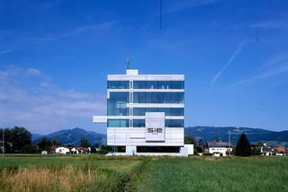
Ø the sculpture modelled in concrete draws its strength from the exciting dialogue between differentiated concrete surfaces [ - bodies ] and wide glass diaphragms. The reinforced concrete has its effect on the one hand by means of the power of its massive appearance and on the other hand by its extreme loadability in all three dimensions. The quality of free workability makes it the only medium of the modelled large form.
Ø the flat hierarchy, as it is practiced by the SIE company, obviously required on first conceptional considerations a one or two-story industrial building. Only after intensive analysis of the topic it became clear to us, that this would the wrong way to deal with it...
... the rough concept developed by us reacts completely different to this neutral position desired for the individual work areas. With a valuation-free layering in vertical direction the building is not divided into an office and a production area. Instead, levels for variable use are layered one above the other. The equal equipment of the entire building makes it possible to use each level either as an office surface or for light production, depending upon need. The "producing" coworker finds itself on the same level as e coworkers from development, trading and management.
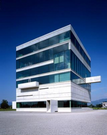
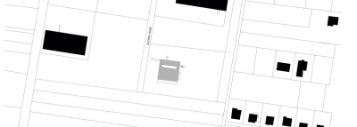
Ø the almost cubical volume resulting from this ideology supports shortest internal ways. A generous ramp leads the visitor into the entrance and exit area where goods are received and the dispatch is being completed. Across open vertical access elements the visitor is led through the introverted storage level on the first floor to the above located production and development levels. The cafeteria is situated inmidst production and development and is meant to become a meeting point for all employees. All the working places open generously to the surrounding landscape of the Rhine Valley, balcony-like elements add to this relation with nature. On the roof a sun terrace for the coworkers is located.
Ø The balconies are extremely important: on the one hand for the formal equilibrium of the cubical volume, in reconciliation to the long entrance ramp and to the delivery ramp - on the other hand they offer the coworkers the possibility of stepping in front of the building and experiencing it as a whole
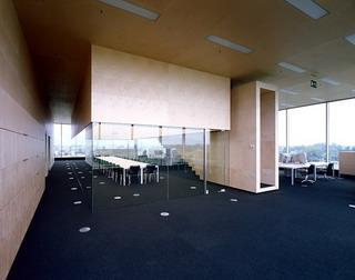
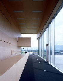
Ø The material language of the building is reduced to materials such as fairfaced concrete, birch wood, aluminium and glass. The only occurring colour is black-grey. The facade is a post latch plate construction with nature-anodized aluminium profiles and triple glazing with sun protective coating. The interiors are determined by birch plywood on walls and ceilings[ acoustics ], as well as black-grey, high-deriving felt respectably epoxy resin linings. An exception is formed by the storage level, where the walls are disguised with cottonwood plywood.
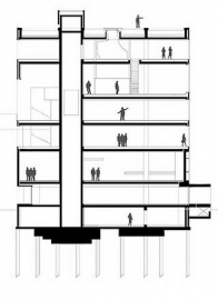
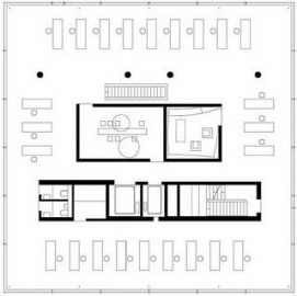
Ø The static basic concept and the variation of the room heights over the individual levels, grant the interiors a pleasant individuality, which is not apparently noticed by the viewer but subconsciously experienced. The core as well as the inside positioned supports form the backbone of the construction. The static concept of the ceiling edges is not based on a monotonous pattern of props, instead each level has its own constructional principle...
[ e-01 ]
The basement develops on a substantial reinforced concrete structure and builds thus together with the partially over two meters strong base plate the socle for the distribution of the forces into the establishment of depth.
[ e+00 ]
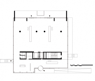
In the reception and delivery area a natural combination of four star-supports, a concrete column and the objective-like loading ramp carry the loads with playful ease.
[ e+01 ]
The storage area is located on the first upper floor and is accordingly drafted as all-round closed "container". Only narrow horizontal slots and an indentation in the north form this construction unit.
[ e+02 ]
The first production level is dominated by two concrete disks located inside in the south, the attached wall with the companys ci in the east and the light star supports in the north.
[ e+03 ]
In the south of the second production level the two story support-free area of the Cafeteria - the ceiling is hung from the roof structure - is located and in the north for a last time the star supports.
[ e+04 ]
Level+4 [ development ] is completely support-free in the boundary region - the ceiling is hung from the roof structure.
[ e+05 ]
Level+5 [ development + trading ] is characterized by 4 linkages at a time [ DM 50mm ] in the south as well as in the north.
This constantly changing form of the carrying construction has a very strong influence on the outside appearance and corresponds to the likewise changing ceiling faces and the out-modelled respectively attached concrete elements. The interior effect of the individual levels is likewise diversified for the viewer and serves clear orientation in the building. The construction made of reinforced concrete is more than only static necessity, it creates exciting dynamics in the individual ground plans and makes it possible for the user to get a clear orientation in the building.

