WIT Architects Office
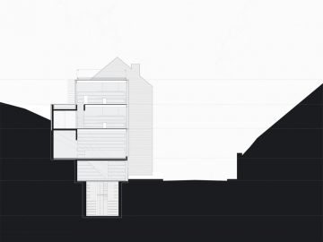
There is an office at the foot of Keizersberg that houses WIT. Tomorrow it might accommodate flats or a one-family house, a commercial space with apartment. Circulation and services allow for a multitude of uses. The design is barely more than a section.
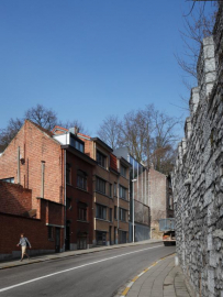
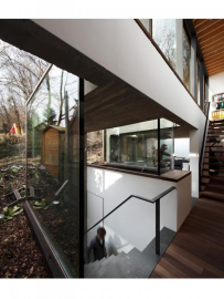
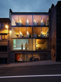
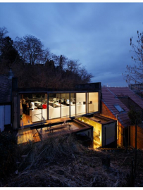
A retaining wall controls the hill and conquers space. As the wall folds, it gains in strength and creates niches with services. The wall is in concrete. The niches are in stone. The wall preserves the conquered space free from complexity: an unfussy prefabricated structure in steel and timber simply provides stacked spaces, plastered white with timber ceilings and padouk floors. The facade is but a glass membrane allowing for maximum sunlight penetration. The stack of open spaces reveals subtle differences, as if the geological stratification of the excavated hill echoes in the equivalent stack of spatial qualities.
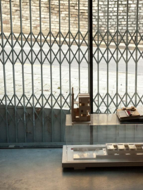
The visitor hesitates. The passer-by looks up, confused. What exactly is the ground floor? Where the hell is the entrance? Downstairs is only an excavated cellar. Is this where models are being crafted or exhibited? The building pulls in the public realm and exposes the private. The distinction private-public is about gradations, paving stones and thresholds, about continuity and filters: the half-open fence, the sliding door, up the stairs and around to the landing. This building aspires to be urban architecture. It is accessible, inviting.
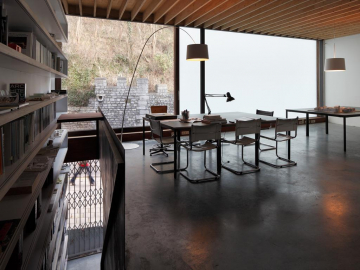
The level above accommodates space for meetings. This is WITs living room. White opaque glass provides privacy and takes a distance from the busy street. The duplex above is the workspace, with views on the abbey park or the leafy backyards. Bathing in light from both sides.
Every workday, the metal fence slides away. When it opens, the whole building opens. The clutter, the models and tools remain visible from the street. This building does have a slightly exhibitionist twist. In the absence of a neighbour across the street nobody really bothers anyways. At night, the office lights up the Keizersberg. During the day, it overlooks the theatre. A girl swiftly climbing the hill. A trailer losing its load.
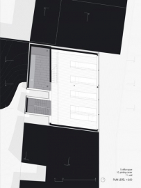
Details only exist to sharpen the choices, the conception of a rational structure. Further design is irrelevant. The building (269m2) stands on a tiny plot of 87m2. The unusual 82.5°-coordinate system of this parallelogram seems sufficient to break away from the sterile plan-regularity. With the oversized furniture, it actually seems to make the spaces bigger than they are. Desks measure 330x80x75, the cupboard of 800x100x45 is a parapet, bookshelves of 550x525x35 hold the stairs.
Context and unruliness can coexist. Indeed, while completing the row, the building doesnt hold back in emphasizing its kink: as a break in the building line, and as a welcomed addition to the gloomy street. Would this be critical contextualism? The combination of embedding and inverting? Willingness and recalcitrance? Countering the impossibilities with merely one precise move, deriving a form from the sum of constraints?

