Commissariaat voor de Media Building
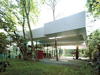
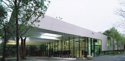
The offices of the Dutch Media Authority are appropriately situated on the wooded edge of the Hilversum media park. Thanks to the regulated confrontation with the natural surroundings and immaculate materiality and detailing, the building emanates a pleasant air of tranquillity and wellbeing. The main themes of the design are the natural features of the location, the relationship between the building and its surroundings, and between the users of the building and the landscape.
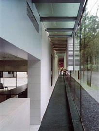
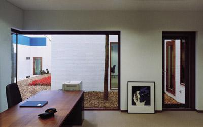
Where possible, the structure absorbs the landscape and subordinates itself to the slope of the site and to the existing trees. The elongated roofline follows the configuration of the land as it slopes down from the street. Patios have been cut out of the building volume around several pre-existent trees. Furthermore, openings have been cut out of the huge roof overhang at the main entrance for the benefit of trees. The corridors, which gradually assimilate the increasing difference in floor level, are located along the two long façades. The offices are reached via secondary passageways at right angles to the façade. As people walk along the corridors, openings and large areas of glass in the façade afford glimpses of the surrounding landscape. The work areas, by contrast, are focused exclusively on meticulously designed internal patios. Unlike the taut outward-facing façades of glass and metal, the patio façades present a differentiated composition of staggered windows, masonry walls and several splashes of colour.


