Restructuring and Extension of the Museum Boijmans Van Beuningen
The Boijmans van Beuningen Museum in Rotterdam has been built in several stages. Over the years, new wings have been added to the original 1935 brick building by Johan A.G. van der Steur, with its symmetrical frame of museum rooms around two courtyards. In 1972 Alexander Bodon, in response to performance and installation art and the consequent need for an extensive exhibition area, built a large exhibition hall lit from above. It is a businesslike space whose dimensions mean it can easily be considered as a third - covered - courtyard. Later still, under pressure from a growing culture of entertainment, the museum was given a new entrance with a bookshop and restaurant, built in the full modernist glory of steel and glass architecture but now already demolished. In 1991 Hubert-Jan Henket built what is called the Van Beuningen-De Vriese pavilion in high-tech style on the garden side of the museum.
The extension carried out by the museums former director and the architects Robbrecht and Daem goes beyond the addition of the umpteenth new wing or pavilion. A new exhibition circuit was developed throughout the existing buildings. To achieve this, not only was an enfilade of small museum rooms built round the Bodon room: subtle but vigorous modifications to the existing buildings also made for a thorough transformation of the museum.
This transformation begins with the moving of the entrance. The construction of the Bodon wing had completely upset the original symmetry of the Van der Steur building with its entrance under the tower and on the axis of the two courtyards. This entrance also presented the museum with problems, since it was not suitable for the smooth running of public exhibitions. For this reason the entrance was moved to the courtyard where the original staff entrance was.
The restructuring of this courtyard meant that the entrance came very naturally to be at the centre of the museum. All at once a reassuring symmetry could be sensed once again. This courtyard, transformed into a forecourt, also plays an important urban design role. It is an intimate public space, made urban by its openness but related to the museum by the sculptures, and forms a counterpoint to the expanse of the city of Rotterdam and the museum park.
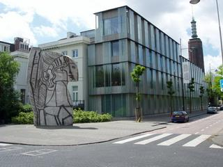
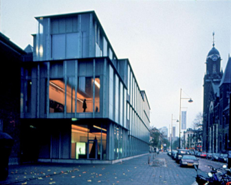
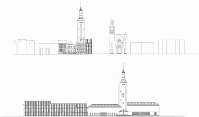
The ambition of integrating the museum into the city is also expressed in the new building along the street, a narrow wing that extends as far as the Westersingel. The fact that Rotterdams Picasso sculpture has been moved to the Westersingel at the end of the new wing emphasises this intention even more.
The new wing also enters into dialogue with its surroundings by means of its form. The articulation and pattern of the windows, the concrete panels and the mouldings and cornices, and especially the shallowness of the building, enable the museum to link up effortlessly with the historical residences on the Westersingel.
The flexible arrangement of the new wing is notable. For example, the offices on the second, third and fourth floors, above the library and exhibition rooms, can be put into use as exhibition rooms with only minor adjustments. Robbrecht, who is very familiar with Italian Renaissance and Baroque architecture is here making reference to the Uffizi in Florence, an office building which, by displaying art, became a world-class museum.
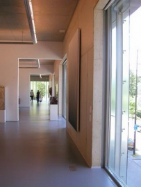
Another notable feature is the range of small exhibition rooms around the Bodon wing, similar to the apsidal chapels in a cathedral. It is as if they have given thickness to the wall, and that forgotten rooms have been rediscovered.
The transitions between old and new have been consistently articulated. For example, at the point where the Van der Steur building and the concrete architecture of the new wing join, a deep, black service passage has been installed. Not only can the works of art here be loaded in and out of a truck under shelter, but they can also be brought right into the heart of the building. Visually speaking, this dark service entrance comes across as an enigmatic black hole, which gives refined expression to the line of contact between the old and the new.
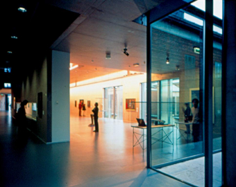
Robbrecht and Daems architecture is characterised by the sublimation of practical problems into a pure, visual, almost sensual experience. They approach their materials, such as glass and concrete, in a way which one might call painterly. It becomes clear precisely what this means in the interaction between the concrete architecture and the floating glass screens used in front of the facade of the new wing. The opaque cathedral glass of these screens makes the view to the outside blurred. So the visitor does have contact with the outside world, but without its penetrating fully through to him and getting in the way of contact with the art. At the same time, this cathedral glass, at certain positions of the sun, is able to capture light and radiate it. This light effect is intended to make the museum building appear to dematerialise. Robbrecht actually considers glass and concrete to be related materials. And it has to be said that in the new wing the velvety grey etched concrete harmonises perfectly with the opaque illuminated glass.
And these pictorial concerns may make one forget that Robbrecht and Daems modifications are subservient to the art. The fact that the museum rooms in the new wing are in bare concrete shows that Robbrecht and Daem are confident that this >naked= building provides suitable accommodation for the art. They are not dogmatic in this however, since in the rooms upstairs they use classic white walls.
When Robbrecht designed a floor and wall construction for the Floor for a sculpture, wall for a painting exhibition in 1987, for the best possible presentation of a sculpture and a painting, he drew up all the guidelines for an autonomous but above all subservient architecture. With the discreet but defining presence of architectural acts, the renewed Boijmans van Beuningen Museum once again proves the selfless willingness of architecture to serve.
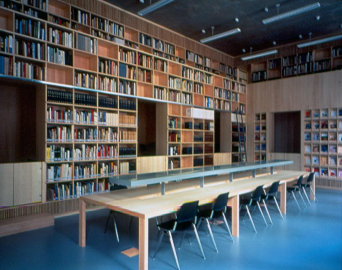
The museum is of course in the first place at the service of its visitors. This also underlies Chris Dercons idea of expanding the museum into a centre of knowledge. This takes shape in the library, which was designed as a single piece of wooden furniture, taking as its example Hieronymus study with its intriguing interior of wooden cupboards and seat. This library, located at the end of the new wing, occupies a strategic position between the more intimate life of the museum and the public bustle of the city.
Thanks to their consistent reinterpretation of the various wings of the museum and the fundamental transformation of the transitional zones, Robbrecht and Daem have succeeded not only in giving shape to the Boijmans van Beuningen Museum as a place of heterogeneous fragmented space but also, and above all, as a place for art. This is also why it deserves a place in the short history of contemporary museum architecture.
Koen Van Synghel
(extract from Jaarboek Architectuur Vlaanderen 02-03,
edition 2004, Vlaams Architectuurinstituut)


.jpg)