Chapel of St. Lawrence
The Vantaa Parish Union held an open architectural competition in 2003 for the design of a new chapel in the vicinity of the historic Church of St. Lawrence.
The winning entry, out of 194 proposals, was Polku (Path) by Avanto Architects.
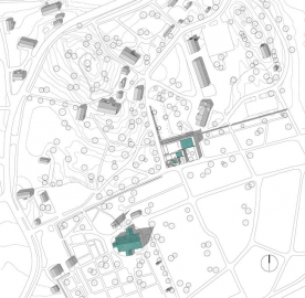
Context, Massing
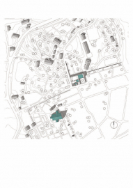
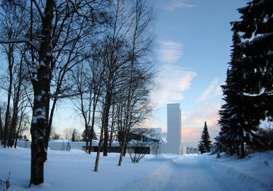
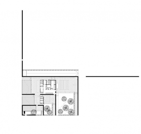
The old stone church with its bell tower remain the dominant features in the landscape. The new chapel ties together different aspects of the area without emphasizing itself. The chapel connects with the graveyard, leaving the old buildings with their own boundaries and territories untouched. It delineates the northern boundary of the graveyard. The chapel has been divided in smaller parts to adapt with the scale of the surroundings. The stacked stone walls of the cemetery are echoed in the design a series of three chapels of different sizes are nested within orthogonal masonry walls.
Structure, Materials, Lifespan
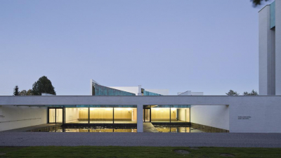
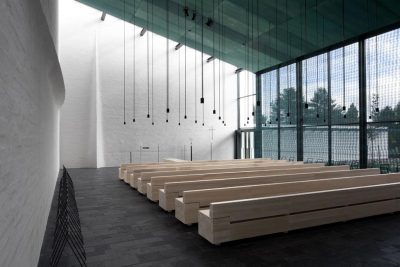
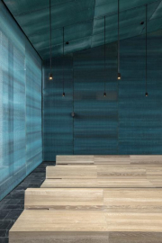
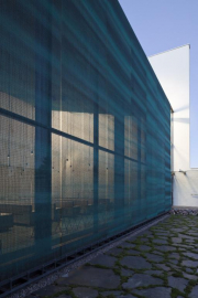
The building uses similar materials as the old structures in the area. The massiveness of the load bearing solid masonry walls balances changes in temperature and moisture. The lightly plastered and whitewashed walls are a bright, tranquil background for the events taking place in the chapel spaces. The partition walls are in-situ cast white concrete and the roof is of patinated copper, like the roof of the church. The patina in all copper surfaces in the chapel has been added by hand. The ceilings and the glazed walls toward the graveyard in the chapels are covered with a patinated copper mesh; it functions as a screen between the outside and the spaces of the chapel. The mesh also decreases heat loads from sunshine. The low stone walls flanking the small gardens and courtyards use stone extracted from the site.
The lifespan target for the chapel is two hundred years. A lifespan simulation was used as an aide for the design. An important factor in choosing the materials was locality in addition to longevity; and on-site building and an emphasis on craft were distinct features of the whole project.
Space for grief
The experience of the mourner was the basis for the design process. The funeral is a unique and taxing event, and for it to go well and without disturbance is of the utmost importance. The architecture of the chapel is designed to assist the mourner, giving space for grief. The people attending the funeral follow a silent route through a series of sacral spaces, punctuated by intermediate rooms. The intermediate spaces prepare the visitors for the next phase of the funeral.
An open art competition was scheduled before the final construction documents were drafted, so that the art could be integrated as a seamless part of the architecture.
Path, a symbolic route
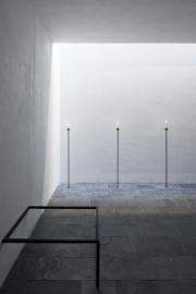
The chapels architecture is a depiction of the passage of a Christian soul from here to the hereafter. The route passes through the silent chapel, into the graveyard. The whitewashed masonry walls and a continuous skylight next to it lead from one space to the next, from the low and dark to the lofty and light.
We approach alongside the outer wall. The wall and the bell tower at its end speak of the earthbound journey and its ending. We turn the corner and, sheltered by an overhang, follow the wall, to a small courtyard - a small pond, with natural stones at its bottom.
We enter a dimly lit lobby with a low ceiling, we can glimpse the entrance court and the old garden of the vicarage behind us. Here it is possible to stop for a moment and reflect on the experiences and life shared with the deceased.
We follow the skylight to the chapel. The chapel opens up, a high space terminating in the brightly lit junction of the masonry wall, where the deceased will be met by the mourners. The wall towards the graveyard is semi transparent, glazed with a patinated copper mesh on either side, a screen between this life and the hereafter. From the chapel we exit, under the cover of an overhang, through a small garden, to the graveyard. The path turns but continues.

 copy.jpg)
 copy.jpg)
