House in Alcanena
The initial sketches for the project were in line with a nearby Roman villa. As the project developed, the images gradually lost that link, leaving the essentials: the physical elements that make up buildings.
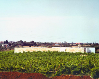
The lie of the land had been marked out with rows of vines, parallel lines cut by a nearly orthogonal system of tracks. Almost in the middle was a rise, and nearly at the top of it, the building.
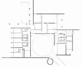
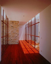
The house did not look like a single unit, but rather was spread out in three sections bedrooms, living rooms and service quarters- around a central patio. A U-shaped gallery served to link them together.
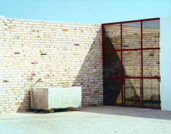
The reference axes for the project also orthogonal- did not impose themselves on the lands compositional lines. Centring on the middle of the patio, they turn almost through 45º, lying better with the landscape. When the work had begun, a water tower which was not needed was demolished, a cellar was dug; and the iron widow-frames were replaced with natural coulored aluminum ones.
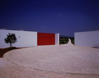
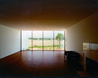
Amid white walls, in store and brick mirror-glass was placed. Amid white walls, in stone and brick, the landscape swept gently up in symmetry.

.jpg)
.jpg)
