The Ribbon - Day Camp and Sports Center
Nonconformist and bold
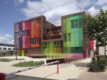
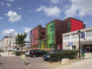
No sooner have you left behind a quiet row of smart private houses in the traditional millstone grit Parisian style with front steps and plane trees than you come face to face with an odd-looking building, imposing but also childishly simple, more cubist than cube-shaped, decidedly flashy, evoking happy memories of a childs toy.
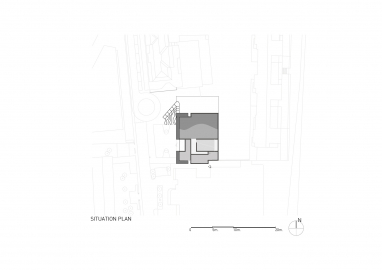
With its cheerfulness and nonconformism, the building contrasts strongly with the urban development zone in which its located, behind a new block of private apartments and next to neo-Haussmannian offices and a day-nursery in a similar style. It is with the facing 1930s infant school that it empathises, extending the metaphor of the balcony courtyard, the passageways, the brick colour and the forecourt. As for the 1970s infant school next door, it maintains an obvious affinity with it in terms of shapes, only to dynamite the whole lot.
All in all its an odd little castle and cubist mountain, that owes its existence to the boldness of the Saint-Cloud Town Council, which has thereby acquired facilities that have revitalised its image and opened it to the most contemporary and positive architectural thinking.
Superimposed but not separated
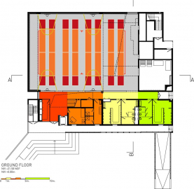
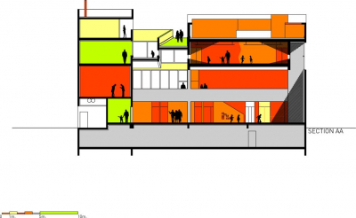
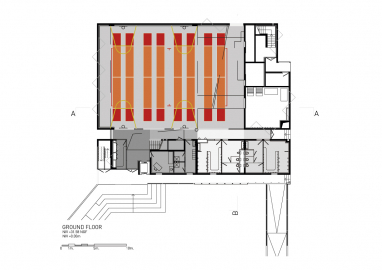
This brief provided a real headache: how to accommodate two autonomous programs on a narrow plot of land. KOZ chose to:
- extrude the available area to the maximum height and hollow it out as with canyons that bring a clear and massive outdoor light deep inside the block.
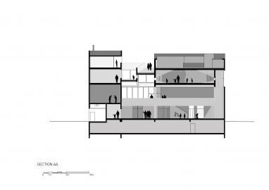
- superimpose the two programs without isolating them, by creating visual links between activities and applying the same principles on all facades and in all spaces.
A PURE COLOUR SCHEME
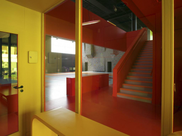
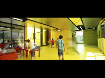
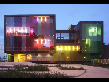
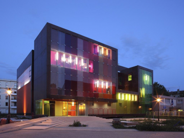
The building uses colour very openly and assertively, with a wide palette ranging from red to green, by way of yellow, pink and orange. These colours cover the façade in wide stripes. Inside, the same colours are systematically repeated, like stepping in an oversized graffiti.
A colour coding that helps you locate from the outside the areas created on the inside. A means of spatial orientation for young children. An echo to street culture codes for those who crawl on what is dubbed the coolest indoor climbing wall in France,or practice on the pop fencing rows below!
A concrete ribbon
The building is a vertical pilling of activity spaces (gymnasium, climbing walls, leisure centre, outdoor area) wrapped in a ribbon of concrete providing unity to the whole . Concrete was the natural choice as it highlights the buildings sculptural appearance while satisfying the requirements of:
- superimposing of large rooms atop the gymnasium with little load bearing possibilities
- acoustic insulation between the two components of the project.
The project is broadly made up of prefabricated concrete load-bearing panels.
The moulded and tinted reinforced concrete contrasts with the coloured surfaces of the laminated panels.
Coloured facades
The main facade is made of tinted glass with a colour gradient from red to green. The other 3 facades are more homogeneous, albeit coloured too.

