Terminal of Seville San Pablo airport
Challenging the usual practice of making generic airport buildings lacking the personality of their cities, this one offers travelers a large space where a series of linked domes alludes to Seville’s architecture.
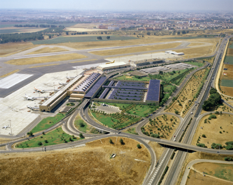
With a landscaped parking lot that softens the transition from one means of transport (the automobile) to another (the airplane), the airport acts as a conveyor belt between highways and roads, on the one hand, and between take-off and landing strips, on the other. Indeed, anyone interested in this airport should examine the roof plan, which explains and expresses its architecture like no other graphic document of the project. Seville’s airport proves that a parking lot need not be a hostile place; if there is a city where it makes sense to make a parking lot a garden, that city is Seville, whose streets abound in orange and palm trees. An example of mat-building, this work is proof that the principles associated with Team X remain valid.
On the upper level, the volumes come in this order: access, concourse, services, corridors, ramps, gates, fingers. On the lower level, the reverse: fingers, ramps, corridors, concourse, services.
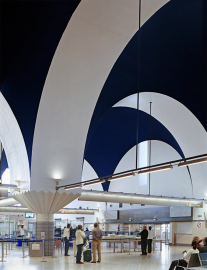
The section reveals the special importance given to the large volume containing the concourses - both for departures and for arrivals - to the point that it could be taken to be a separate building, with all the other constructions gravitating towards it as mere subsidiaries. A double line of vaults - lowering onto impressive arches that are held up by columns crowned by special capitals that make such transition possible and play a crucial role in the figurative definition of the concourse - generates a dilated, seemingly infinite space in which the longitudinal faces are clearly drawn.
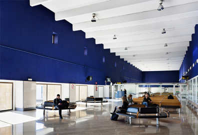
The immense departure concourse, with the deep-blue color of the vaults as its main feature, is meant to be the point of encounter between sky and land, the place materializing and propitiating transit. The idea is for the space defined by the vaults to act as threshhold to the sky, or in other words, as the new and true ‘gate to Seville.’
As for materials and methods, the idea was to make use of construction systems coherent with the architectural criteria. For example, the choice of typology (two levels with the fingers in a row, as is correct for terminals of this kind) required allowances for future extensions of the floor plan and for possible serialization of the constructional elements. The idea of future serialization led to the use of light prefabricated materials throughout the building.
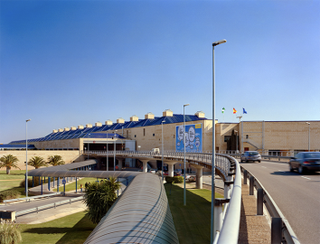
A vital contributor to the physical appearance of the new terminal is its enclosure of concrete blocks, finished in local sands that help give the building a typically yellowish tone. The roofs also bear much weight in the architecture as a whole, and reflect the logic of its construction more clearly than any other element. Resolved in the traditional way, their custom-glazed tiles are an impressive finishing touch capable of reflecting the altitude of the sun at any given time of day. The deep blue of the vaults and interior surfaces are echoed in the exterior, to prolong a contrast that proves invaluable at latitudes where the sun strikes strongest

 © Michael Moran/OTTO
 © Michael Moran/OTTO
 © Michael Moran/OTTO
 © Michael Moran/OTTO
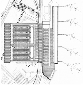 © Rafael Moneo
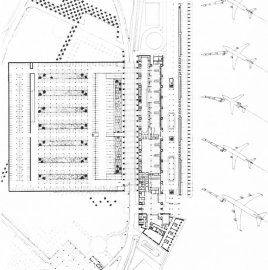 © Rafael Moneo