Snæfellsstofa visitor center
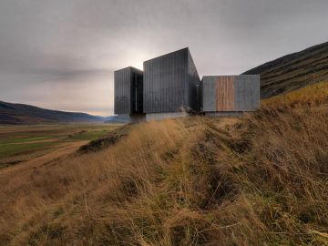
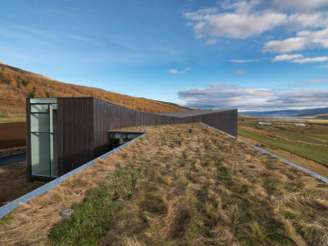
Snæfellstofa Visitor Center communicates the dignity of the surrounding nature and is closely connected to its immediate surroundings.
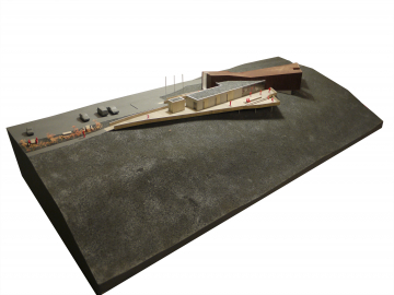
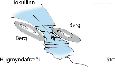
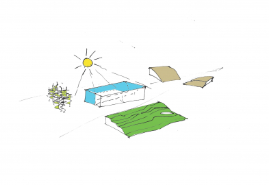
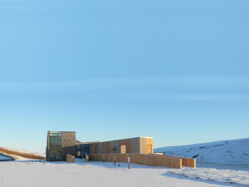
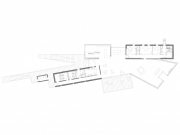
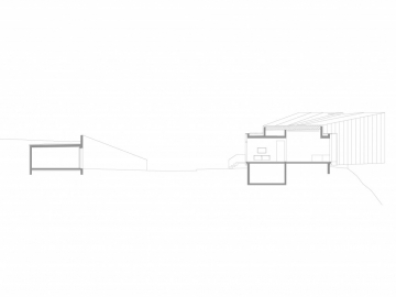
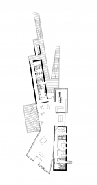
It attracts visitors to its unique appearance and simultaneously works as an attractor for indoor and outdoor activities. The building is divided into three parts so that it can be utilized in different ways, depending on the season. In plan, the building is x shaped. The buildings main axis, the exhibitions- and education axis rises up to both sides and creates a framework for an exhibition space and a library. The exhibition- and education axis rises up from the Rock Foundation as a living and ever changing glacier. The Rock Foundation or the service axis crosses the exhibition axis and houses a café and restrooms in addition to staff facilities.
Through the two axes lies the information path, ending in an outdoor amphitheater.
Visitors are intended to walk up to the building, much like climbers progressing onto the glacier. Thereby, visitors effectively experience the glaciers grandeur. The building stands alone and automobiles and other vehicles are kept to the side and their visual impact reduced by screening them off with vegetation and landscaping walls. Facilities are provided for visitors to enjoy the sites exterior spaces. Pedestrian paths, ramps and decks are built from local wood and their forms steer the approach of visitors up to the building. Staff facilities such as workshop, garage and technical rooms are located so that they are not visible from the approach.
Materials
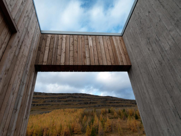
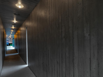
Material palettes are clear and simple. Staff- and service spaces are the foundation for the operations. The Rock Foundation is a cast in place concrete structure with wood board texture both inside and out, with insulation in between the concrete layers. In addition, larch paneling is intertwined into the concrete walls both inside and out.
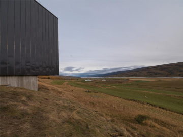
The exhibition- and education axis, the Ice Stream, is constructed of wood. For that reason, that part of the building will make creaking noises depending on the weather, much like a glacier. The axis is clad in locked dark-brown copper on the exterior, but with wood on the inside.
Crossing the two axes is the information path, connecting the axes together.
Internal Arrangements
Upon entry, one comes into a central space that connects reception, shop, library and exhibition hall. On both sides of the central space, facilities for staff and visitors are located. On one side, a café with an image gallery and access to restrooms, which are also accessible from the exterior. On the other side of the central hall, one finds the staff facilities with offices, entry, restrooms, storage and break room. A meeting room is connected to the break room, but the meeting room also connects to the central hall and be used both for staff as an information center or as an exhibition space.
The internal arrangements, and generous ceiling heights allow for permanent exhibitions in parts of the exhibition space, and temporary exhibitions in other parts. There, recessed window openings can be used to allow nature views to flow into the building and thereby connecting exhibition spaces indoor and out together.
Spaces can easily be combined and connected, both indoor and outdoor. For example, meeting room and central hall can be opened up to the external amphitheater. The same goes for café and exterior deck. The design of exterior spaces has focused especially on accessibility and universal design.
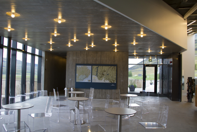
Concept and inspiration for interior- and exterior lighting design is sought in the ever-changing light reflection of the glacier, its eternal creative force and how ice mediates light. Not unlike being inside an ice cave, where the irregular placements of liner lights in the ceilings reflect the light qualities inside glacial fissures and circular recesses in the ceilings are reminiscent of icicles as are vertical exterior lights. In all cases, the lighting concept is based in the creation of defused light
The lighting of various spaces is designed in accordance with the ideas described above, but the spaces have different lighting concepts depending on the use and how the design can fulfill requirements for exhibition design, ergonomics and energy use. Indoor and outdoor lighting is informed by the buildings location and is designed to minimize light pollution, while maximizing the use of daylight.
Breeam
The visitor center has been designed with special emphasis sustainable design and is undergoing BREEAM assessment. Visits to the center can thereby have positive impact on environmental experiences for guests and communicate the message of sustainable design out to the community about the importance of the environmental issues in architecture
The visitor centre is rated as BREEAM Good

.jpg)
.jpg)
 © Rafn Sigurbj?rsson
