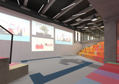
Prezi.com HQ
In the middle of Budapest’s theatre district, between restaurants and ruin bars, Nagymező utca accommodates one of Hungary’s most important technology enterprises. The Mercury Palace, built in 1900-1903 to host the country’s first telephone centre, is a genuine location for Prezi, a company engaged in helping people transfer their ideas.
Enjoying exponential development in the past years, Prezi had successively outgrown its offices. When considering their next move, Prezi’s founders decided to make a long-term plan: in order to manage the process of changing scales, they invited Minusplus to accompany their relocation.
The two firms’ shared history informed the design process: similarly to Prezi’s previous offices, the new headquarters were constructed in phases, keeping pace with the company’s expansion. We knew that they would gradually fill the building, but they were faster than expected. We distributed Prezi’s future functions throughout the whole building, and the challenge was to move all the initial functions in the upper floor and then allow them migrate gradually to the newly converted spaces.
In working with Prezi, we were not only designers but partners in the elaboration of the way of working.
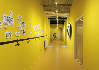
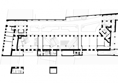
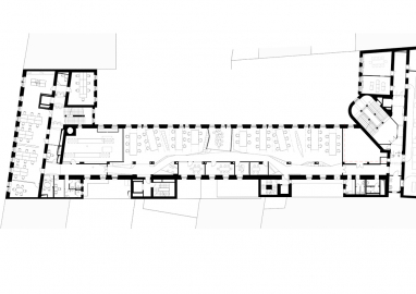
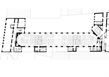
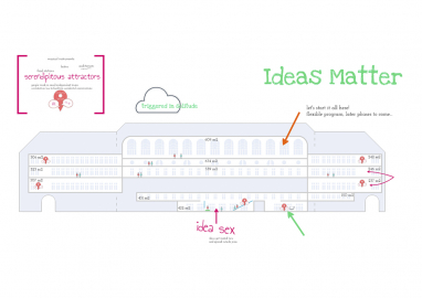
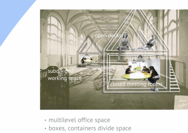
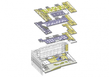
The new headquarters, designed in parallel with the firm’s San Francisco offices, are situated on four levels of the Mercury Palace. The top floor baptized “ballroom” is an urban garden, a large indoor landscape with hills hiding conference rooms. In the smaller offices, plants and trees separating workspaces, a concept recycled from the company’s previous offices. However, each floor and conference room has a distinct identity: as the Prezilians' dynamic work scheme change desks almost every week, each space needs a strong theme in order to help orientation.
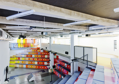
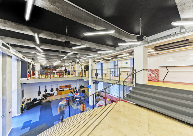
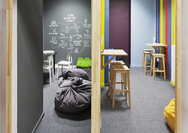
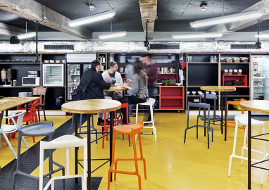
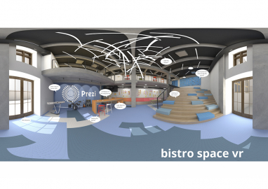
In the absence of fixed working hours, to make people choose to work here, the building has to offer a diversity of situations. When they wake up in the morning and think about where could they work best – in a dark corner or in bed – we want them to find all this here. All floors have coffee or snack corners, inviting employees to engage in social interaction. The entrance area includes a music corner and a bistro that brings visitors to the building’s semi-public auditorium, the “House of Ideas”, where people meet for general assemblies and public events focusing on technology and culture.
Because of the gradual expansion of Prezi in the building’s 4000 m2, we did not want to create a concluded office. We designed unfinished spaces, provoking employees by moveable objects and writeable walls to intervene in their environment.
The unfinished spaces allowed us to learn from feedbacks, understanding what works and what doesn't, and incorporate these experiences in later phases of the design. This is analogue to how Prezi works: changes are incorporated in the software and their impact is tested continuously. In coherence with the flexibility of the spaces, Prezi asked for simple and cheap materials. They wanted to avoid the coldness of high-tech, using wood and often untreated materials to create proximity, intimacy and sociability. Money is not spent to make the space look good, but to make it more functional, with comfortable furniture and good acoustic insulation.
They didn't expect us to give them plans to be built and then leave but to act as consultants of the whole operation. Design is not only an instant here but a process of constant adjustment: it is custom-made architecture.

