Protel Office Building
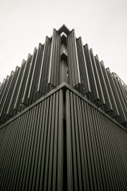
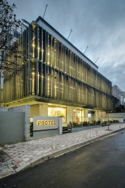
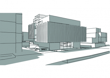
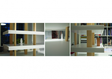
The Protel Building was built in order to bring together all units of the company and to provide a potential expansion area to the rapid growing number of employees. The geometry of the building is determined by a white box and a dark band that envelops it. Indoors, everything is bright, white and spacious, while dark colored and distanced from outside.
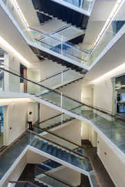
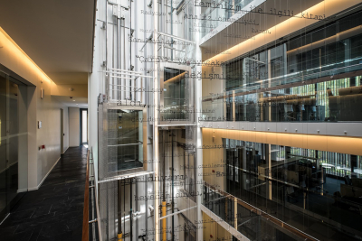
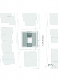
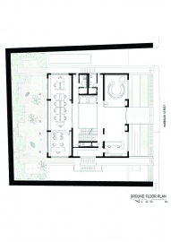
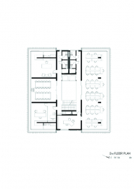
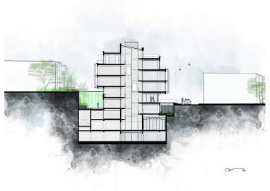
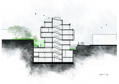
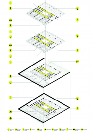
The building comprises the ground floor, the first floor, the second floor, the penthouse, the terrace and 4 basement floors. It is situated on an almost rectangular terrain of 28x29.5 meters with a ground floor on 16x18 meters and the upper floors have been enlarged with 2 meter consoles. The building has two entrances. The main entrance to the building from the street is provided with bridges. The second entrance, which leads to the technical department for customers is situated at the side yard that is next to the storage and the parking, accessible by a ramp. While the building program was construed, an office plan that gives priority to the connections between the floors was preferred instead of a hierarchical internal setup. The central atrium connecting the 3rd basement to the roof creates a luminous circulation space and provides a vertical visual continuity.
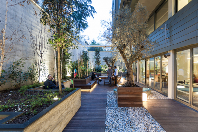
Protel Office building was designed for the team of a software company. The aim of the design was not only providing comfort but also sustaining a qualified working area for the employees. The idea is a building which would be in harmony with its surrounding but at the same time possesses its unique character. All the parcel was designed as a whole living space. The internal alleys, terraces, gardens which are the extensions of the working areas propose to the employees different opportunities of repose and social interactions all day long. The bridges which connect the building with the street are also the part of the filtration from the street. The movement in the atrium and the working areas can be completely perceived through the two elevators. The working spaces are placed in different but visually connected levels instead of a stacked layout, but rather an open office space with different levels connected to each other, which enhanced the visual interaction possibilities between the employees.
The rectangular prism form of the building which is divided into two parts by the atrium is designed by levels instead of floors. As a result, the concrete white blocks which were constructed separately, are connected with steel stairs and a rooftop. The band which surrounds this white box comprises panels which are attached to the perimeters of first and second floor consoles. The perforated panels produced from aluminum, rotating in different angles, provide daylight control and a filtered connection with the street. Surfaces behind the mobile panels were not left with paint but covered with titaniferous zinc. Light colors were selected for the painted areas. By doing so, the prismatic white box determining the main block could be perceived both from outside and inside.
The corridors around the atrium are considered as the circulation zones serving as internal streets of the building and for this reason, they were paved with natural stone. Besides natural stone, aluminum, glass and wood was also used inside the building. Further acoustic needs were taken into consideration in departments serving as a call center in order to increase the comfort of employees.

