Sparkasse Ulm
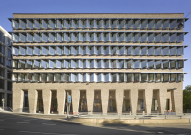
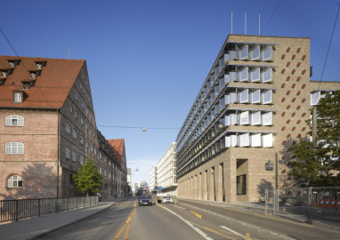
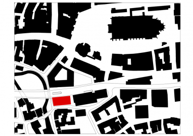
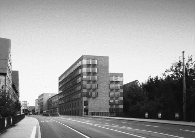
The entrance to the city centre of Ulm is formed by the Sparkasse Ulm together with the striking building of the police, known as the “Neuer Bau” (New Building), situated at the Neue Straße (New Street).
Neue Straße (New Street), a broad traffic artery carved out of the city at the beginning of the 1950s, was scaled back in the 1990s. New buildings in Ulm – one for the Sparkasse savings bank by Stephan Braunfels and another for Kunsthalle Weishaupt by Wolfram Wöhr – marked a successful return to a denser cityscape through the use of architecture with a strong commitment to modernism. The model for this cultural change was unquestionably the initially controversial but ultimately successful Stadthaus by Richard Meier, located across from the Ulm Minster.
A further element in this series was the annex administration building that the Sparkasse planned to build at the western end of Neue Straße, as an extension to its central office from the 1960s. In collaboration with the city, Sparkasse Ulm held a competition for this building in 2007, and our office submitted the winning entry.
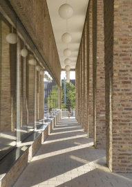
Based on our past experience with used bricks, we were able to convince the client of its advantages. Not only does it establish accord with the historical façades, but the reuse of materials from demolished buildings is also an important matter in relation to sustainability and concern for material cycles. Thus two issues come together here: that of the cityscape which we have been entrusted to augment, and that of sustainability itself. We also believe that, in this way, a harmonious accord with existing historical buildings is possible without having to imitate or mimic their formal repertoire.
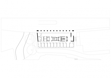
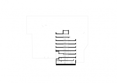
The essential idea for our design rests upon the question of what kind of building could offer the best added value to the city on this site. On the opposite side of the street to the north is a strikingly massive building from the 16th century, known locally as the “Neuer Bau” (New Building), whose brick façade nobly marks the beginning of Neue Straße. We decided to juxtapose this richly historic place with a building that, together with the “Neuer Bau”, forms an ensemble at the entrance to Neue Straße. Apart from that, the street forms an edge which slopes downward towards the south by a good storey. The building’s form echoes this sloping terrain, which still remains legible in the setback at the penthouse level. The neighbouring buildings to the south are arranged with a typical inner-city density, so when the new building is seen from there, its real size of cannot be perceived.
We liked the “Neuer Bau” and its old brick walls very much. That includes the adjoining sections of wall that extend under a bridge beneath Neue Straße, leading to the new building. Hence it seemed natural to use a similar material for the solid parts of the walls of the Sparkasse.
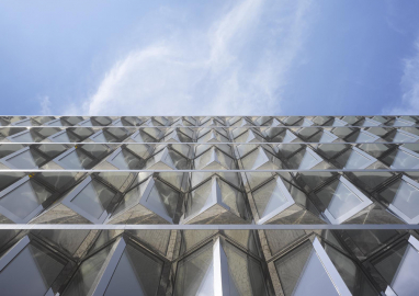
We contrasted the very solid character of the brick wall with zigzag bands of windows made with polished stainless steel frames. The projections and recesses come from our recognition that by folding the wall inward and outward like bay windows, the small offices have a much more pleasant atmosphere. Keep in mind that the smallest rooms permitted by the office grid have a width of 2.7 meters. Folding the window bands also had an effect in the public realm that we welcomed. Not only because the façade of the “Neuer Bau” is reflected therein many times, but also because Sparkasse Ulm thereby demonstrates exemplary treatment of the historical surroundings while simultaneously giving expression to its modernity.
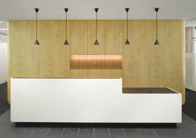
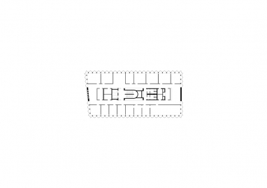
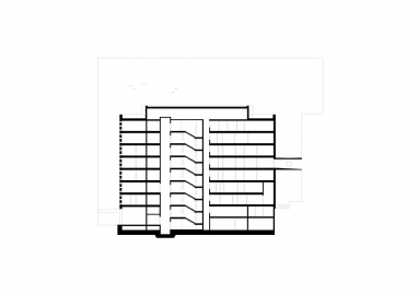
In the floor plan, the six - to seven storey building has a typical double corridor layout: offices along the perimeter receive ample daylight, and ancillary spaces, corridors and tea kitchens occupy the middle zone. The inner core is clad throughout with birch veneer and the walls opposite it are made of simple modular office partitions.

