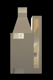
Extension of the Fine Arts Museum of Asturias
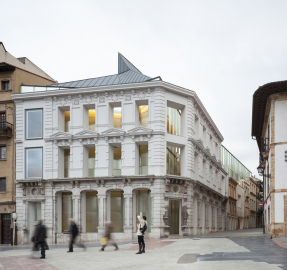
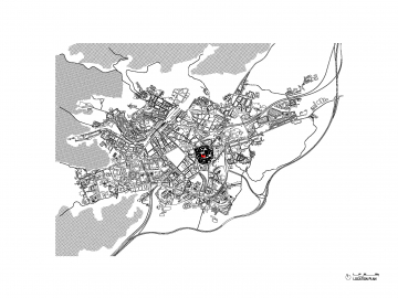
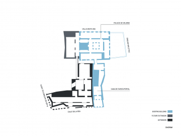
The new extension of the Fine Arts Museum of Asturias, a very important north Spanish region, is integrated into an urban complex which through successive expansions has made room for one of Spain’s finest art collections. Before that, the museum’s most important architectural piece was the Velarde Palace, which is a splendid renaissance building.
To carry out the enlargement, the museum for a time went about buying adjacent buildings facing Calle de la Rua with floor plans that were narrow and deep, spaces that were small and badly ventilated. Internally they were impossible to turn into exhibition spaces for the museum, but their exteriors, though not extraordinary, were in dimensions and scale an integral part of the collective imagery of the historical city of Oviedo.
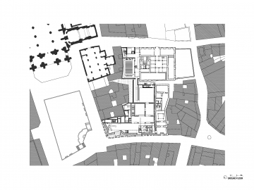
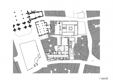
The program mainly comprises new exhibition galleries as well as all the museum’s archives. The archives were previously situated in basement levels. The new enlargement project logically began with an analysis of the museum as a whole, taking into account the existing buildings. The first object of study was how existing and new buildings would relate with one another, along with the relocation of a good number of functions within the existing complex.
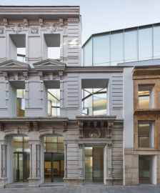
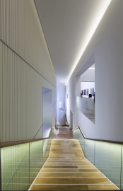
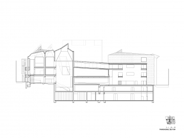
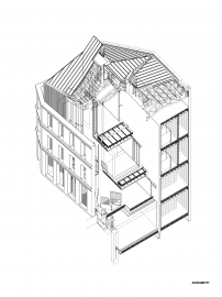
The first decision was to preserve the urban canvas formed by the existing facades, while freeing up the interior through complete demolition. It seemed a necessary concession to the urban context. We accepted the challenge of making the new construction reconcile a project of architectural contemporaneity with the maintenance of the urban ‘curtain’, irrefutable and beloved by the population that shaped a street which is so important in the history of the city. Awareness of this led us to place the staircase parallel to the street, thereby creating a facade-space comprising three canvases: the historical exterior, the glass enclosure of the new volume, and an inner wall open to the museum stair. A space where history and novelty are superposed, where views between inside and outside are never immediate, but take place through awareness of the passage of time, represented in the superposition of the three limits.
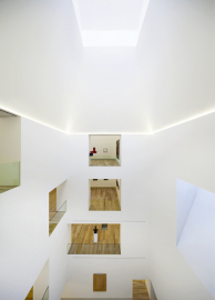
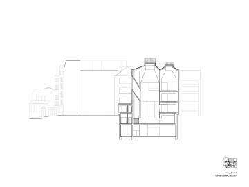
The building’s internal layout acknowledges the inner block courtyard’s presence in the city as a mechanism for adapting to the context, but also as an element able to structure and give spatial quality and luminosity to a sequence of exhibition spaces.
The new volume is glazed, luminous, seeking to catch reflections of the historical facade and allow them to complete the formal effect desired. The light of Oviedo, ever changing in an extraordinary way, can thus act with closely studied and sought intensities and results.
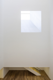
The decisions so far explained are complemented by a systematic use of natural light, surely the best material in architecture. Here the higher floors receive zenithal light through skylight volumes on the roof, built with zinc, which are able to engage in dialogue with the roofs of the surrounding buildings, in particular the cathedral. The vertical illumination is complemented by large openings on the facade here and there, and in a special way in the large court, where is takes on a near-sculptural character. Openings with large dimensions and thickness which use aluminum on the sides in order to intensify and add character to reflections. The white color on flat surfaces in the halls or on the striated walls of the staircase, and aluminum as a material which can reproduce light effects, together shape a special interior, one which varies hour by hour and day by day, like the light of the place.

