Residential care center Kapelleveld
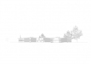
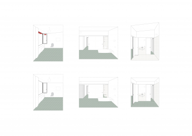
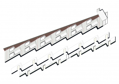
A taller building. An open area. Low in its perception. And not tall at all. A building starting from its rooms. Rooms defined by their windows. That do not only appear in one wall but that goes around.
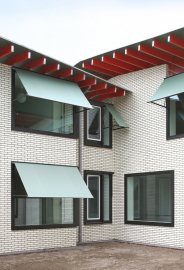
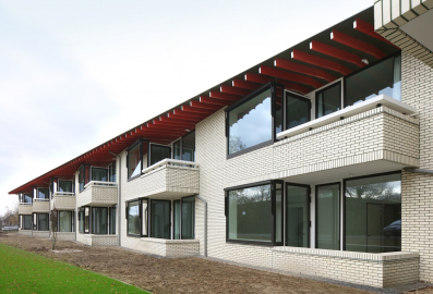
And that idea reshapes the various transferal wings in to a vivid cascade of windows and corners. And all covered by a slowly sloping generous roof.
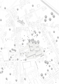
It can’t be more Flemish. Flemish countryside. A small village. A rather stretched out landscape bordered by houses. In the middle an open area.
Housing today is a question on generations. Not only old versus not. But different stages in between. Elderly housing goes together with nowadays service housing. Living apart but with service.
That this program of xx apartments and xx rooms is situated in the middle of individual houses around makes that everything comes together. Every stage of life is present.
However designing such a program is first of all a matter of functionality and economy. Though the expectation of finding a home is the final ambition. Or let’s say maybe the very first.
No matter the scale: feeling home is the ambition. From the beginning. And by the outcome.
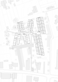
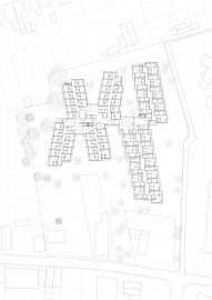
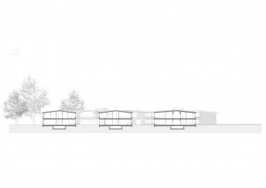
A simple plan. A backbone all over. And transversal wings on both sides. It could not be more pragmatic.
As good as it is a simple plan as good as it wants to be also at the same time a humble but welcoming house. Many houses together. From rooms to flats. But each time a house to feel home.
A low building finds its pace with the scale of its context. Two stories high. Partly inscribed in the slightly sloping landscape.
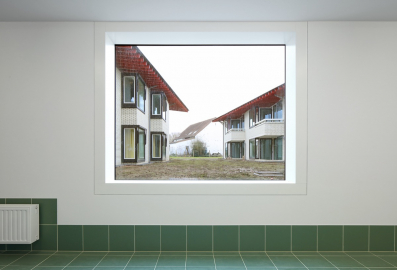
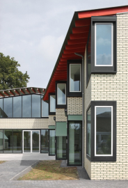
The slowly pitched roof find it reminisce in its surrounding. But not only that. The pitched roof stretches out over the windows. The ceiling follows the roof. A kind of intimacy is given place. Unity by roof en individuality by window. But both together describing the same aim: feeling home. It does not need more. Inside and outside shuffles in between. Perspective found along.
Finding the proportion and scale is at stake. Not only for its relation towards its surrounding. But also as a matter of feeling home. As a matter of creating a trustful and peaceful surrounding.
The new building in the middle is not just anymore a building. It is a meandering complexity though simple context inscribed universum. An universum that gives the feeling of home place.
A solid building. Always the fundament for a long lasting future. But not only that. A building that in its materialisation reflects the tradition of building, of its context and at the same time just slightly differently rewrites it.
Simple glazed brickwork. And nicely differently coated aluminium framework. From dark to more lightly anodised aluminium. Simple green sunshades reach out when it comes.
Red wooden frames supporting the cantilevering roof. Finished with small mirrors at the end and in between.
As it is a low story building and as it is partly lowered in the sloped landscape and nevertheless its meandering ground plan an interesting compactness is achieved. At the same time since that humble height an interesting cost prize proportion is even so good a win.
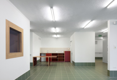
This kind of building always needs a good maintainable interior. The interior proves that this should not be opposite to a nicely environment.

