Expansion Rietveld Academie and Sandberg Instituut
Complementary third building for the Rietveld Academie. The resulting campus provides the art school with a new setting; an open education landscape stimulating encounter and collaborative work, as well as an interactive building; a building for conquest and diverse use.
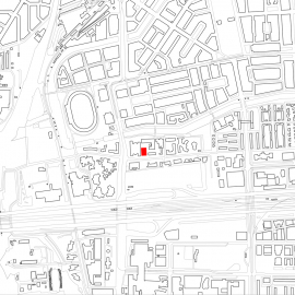
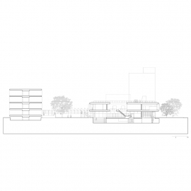
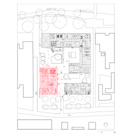
Between all those imposing high-rise buildings of Amsterdam’s new financial district, the cluster of the Rietveld Academie and the Sandberg Instituut remains bravely low. The new building is precisely positioned on a cramped plot in between the two existing academy’s buildings designed by Gerrit Rietveld (1967) and, the first extension, by Benthem Crouwel (2004). The new makers place puts the existing buildings into their own strength and finishes the situation as a campus.
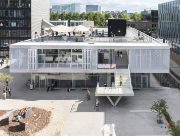
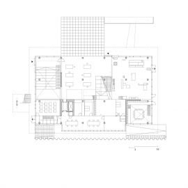
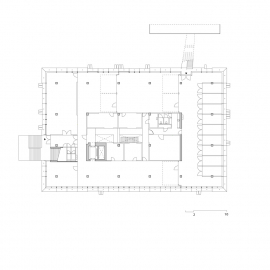
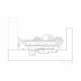
The new building has a rectangular floor plan and consists of three layers, one below ground level and the top one cantilevered. The spaces on the first floor are for the most part earmarked for students of the master course of the Rietveld: the Sandberg Instituut. Other spaces in the building are shared.
While schools tend to develop more and more into flexible office buildings, this school is very much customized for the art-school itself. The building is result of an in-house competition won by Fedlev led by Paulien Bremmer; a multidisciplinairy designteam rooted within the academy, later extended with Hootsmans architectuurbureau. As a user expert, the collective brought in it’s user’s expertise.
The design sought to break through the existing education structure in the service of space for more multidisciplinarity, cooperation and exchange. In this the building is seen an "open" building that offers space for conquest and diverse use.
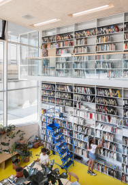
Due to a limited rearrangement of the existing buildings, a collective ground level has been created where the new building offers space for shared functions such as workshops, library and an assembly hal.
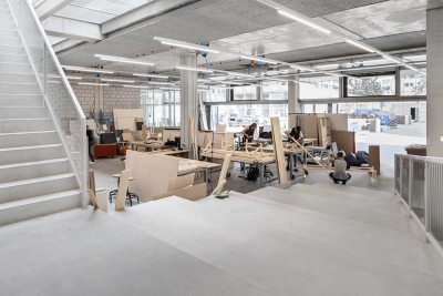
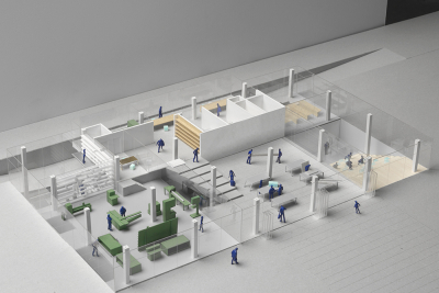
The building is characterized by a landscaped spatiality. Alternating floors connected by stairs, gradually merging into each other. The interior consist largely of glass. Corridors and stairwells have been avoided, so that "the making" by passing through, is continuously visible and interdisciplinary exchanged.
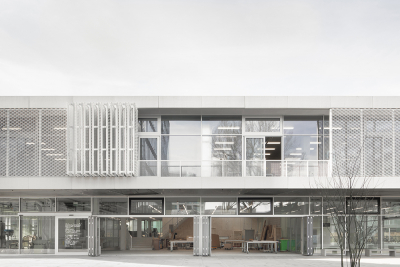
The outdoor space is part of the educational landscape thus making optimal use of the cramped site. The building has 7 entrances. The façade can be folded open, the newly designed tables can be rolled out, and in between the buildings can be worked. The roof, equipped with anchor points and electricity, offers space for to claim for exhibitions, performances, or the making of constructions.
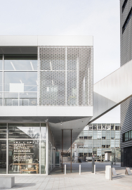
Rhyming with the existing Rietveld building, the solid concrete structure is wrapped in a façade of glass, foreseen with movable aluminium screens. Inside the building, varying, often industrially executed floors and walls define successive places. Direct and unpolished detailing alternates a refined and precise one, giving room for interpretation and strengthening the experience of possibilities.
Diversity is even more increased by means of the 'White Spaces'; parts of the interior the design team reserved to be performed by or with third parties from the community: the interior of the Sandberg Instituut, the library, a ceramic tiled wall, curtains, workshop furniture and outside furniture.
Due to a smart and low-tech construction of the layered outer facade, ventilation is provided naturally and installations are kept to a minimum Thus the user has direct influence on the climate of the environment. The overhangs and the woven steel façade limit heating by solar radiation. Under the overhangs transition space is created to stay, claim or work under.
All analog to the principles of a healthy, flexible - transformable, and thus sustainable open-air school.

