Museum of Contemporary Art
Conceptual analysis
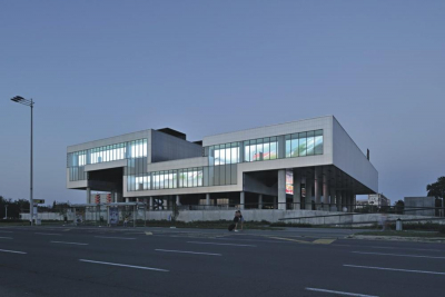
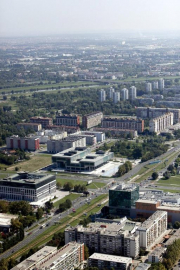
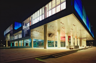
Frani?s project generates its own city-planning within the borders of the parcel and forms an ample square that slowly rises towards the large hovering mass of the Museum which covers the open public space.
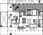
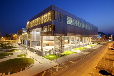
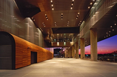
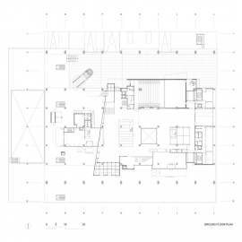
The entire ground floor of the Museum is open to movement, conceived as an extension of the square with the main entrance, restaurant and library, each with a separate access. The glass envelope of the ground floor is not unified, but diversified, which indicates different amenities.
It is obvious that the ground floor is the place of transition between public city space and museum halls.
The entire ground floor of the Museum is open to movement, conceived as an extension of the square with the main entrance, restaurant and library, each with a separate access.
This spatial sequence is unambiguously just a preparation and a part of the scenario of movement suspense and experience of the building before entering the exhibition halls. Actually, we are still underneath the museum.
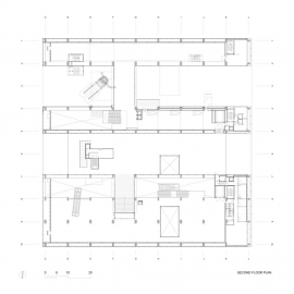
Frani? formed the body of the building as a geometrically very simple solid of approximately square ground-floor plan, whose cross-section is folded in the form of a meander. The configuration of the exhibition space directly emerges from this cascading cross-cut, so that the museum develops in a series of linear stretches vertical to the lateral, meandering profile of the structure. The basic direction of the spaces is defined by the sequence of x-axes parallel in relation to the entrance porch, whereby their format changes with progression, i.e. translation of the floor and the ceiling within y-coordinates. These stretches show different heights and interrelations, and between them flow the terraces or the areas beneath the body of the building, so that along the y-axis exterior and interior spatial segments interchange.
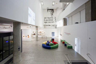
The relationship of interior and exterior design shows a certain inversion of conventions through the harsh interior and sleek exterior. The aesthetics of the interior is neutral and to some extent intentionally brutal. White walls, float finish of floors and unplastered concrete of the load-bearing construction suggest that the museum building is primarily spatial infrastructure. However, along with this acetic approach, Frani? also applies non-purist procedures: all solid surfaces of the meanders body are frontally and underneath clad in polycarbonate plates behind which the carrier construction is visible. Polycarbonate is consequentially mounted also on the ceiling of the ground-floor interior, which unifies the hovering mass into a rounded-up whole.
(paragraph from X-Y-Z, text by Maroje Mrdulja)
Structure and materials
In accordance with the requirements and the wish of achieving as flexible ground floor plan as possible, the basic load bearing structure of the building consists of a spatial skeleton structure, which in its rationality and spatial layout tries to meet all the needs of the Museum.
Reinforced concrete columns and beams set 10 and 20 metres apart, with a ceiling reinforced concrete cladding of 26 cm thickness, are the principal constructive elements.
Total built area: 18 000 m2 ,Site area: 14 400 m2

 copy.jpg)
