Piazza del Cinema
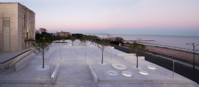
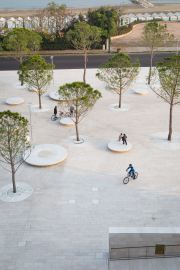
The Piazza del Cinema turns the 'red carpet' of the stars into a ‘white carpet' for all people. The public space sews together the elements which define the identity of the site: the historic buildings of the Casino and the Palazzo del Cinema and a park, connecting them with a stone-made public space, which aims to enhance the splendour of the Belle Epoque.
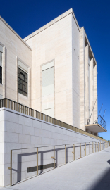
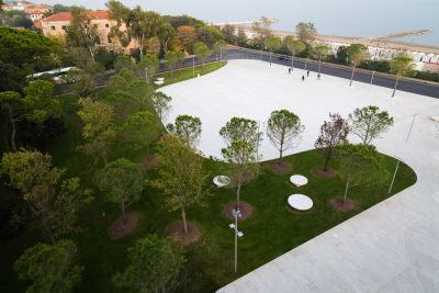
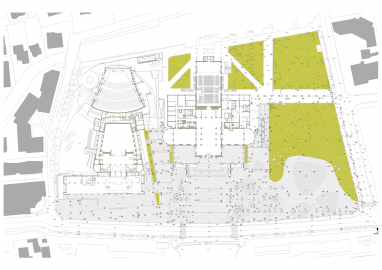
Loosing its role as one of the most sought-after seaside resorts in Europe, the site hosted an international competition for the new Cinema Festival Palace. As part of the commemoration for Italian Unification, the construction stopped under bribe accusations of the public management team, leaving exasperated citizens and the Biennale with a big hole in the ground. Starting a series of conversations with the locals, C+S decided that the main aim of design was that to give back the citizens a well-designed and adaptable public space made of a square and a park, which would be transformed during the three weeks of the Cinema Festival or during the year. The task of the Piazza was also sewing together the heritage pieces (the two Palaces and the park), the latter being for C+S as important as the buildings as home to animals and enriching the biodiversity of the site. A carpet of white Apricena stone is laid among the buildings and the green and designed to highlight the curves of a never built third building, manipulated to be accessible to all or punctuated by precious insertions such as the brass railings, special surface treatments or gutters for water collection. Sustainability solutions are enhanced for water collection, reforestation with local trees.
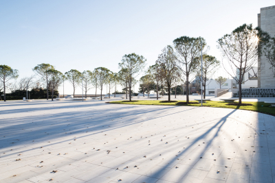
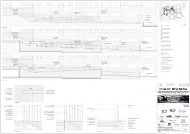
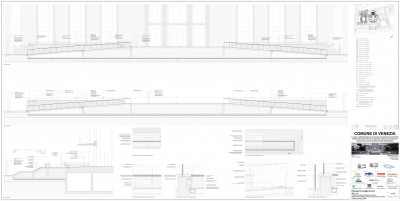
Instead of creating a Piazza only for the three weeks of the Festival, the Piazza del Cinema confirms and enhances the role of the park as a fundamental and consolidated element of the site, rich in biodiversity and home to different animal species. The boundaries of the park are retraced on the geometry of the unbuilt and turn the red carpet of the actors into a ‘white carpet', for all people. With a continuous, white, stone-made public space, C+S aim to highlight the identity of the site as well as the splendour of the Belle Epoque and its generous dimensions. The square is heightened from the original level to allow the view of the sea and is entirely accessible and subtly designed for disabled and visually impaired people. The square is also invisibly infrastructured to allow the activation of events during the rest of the year. The square gives back a free public space to mums with prams, skaters, kids playing with the water fountain, old people relaxing under the shadow of the trees and watching the sea. C+S strongly believe in the power of a free, well-designed public domain to be activated by people, their memories, their dreams and their experiences.
The square is heightened from the original level to allow the view of the sea and is entirely designed using the monochrome Apricena stone, confirming and underlining the dimensional power of Belle Epoque identity and avoiding the fragmentation of the use of different materials.
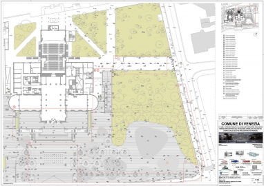
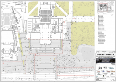
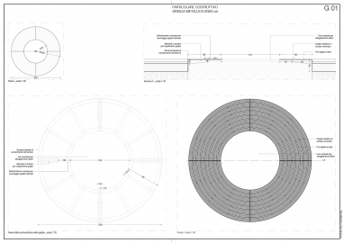
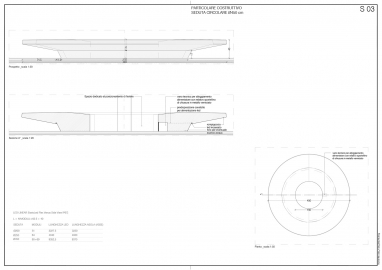
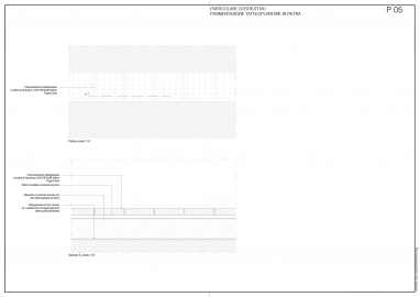
The design of the materiality of the rolled or sanded pieces of the stone, the water drainage system and the fountain (thin cuts and shadows), the brass or varnished steel railings, the benches in reconstituted natural marble stone, the treatments for disabled and visually impaired people, the newly planted and autochthonous maritime pines and the sinuosity of the garden, resembling the geometry of the never built third Palace: all these element are designed as accents and shadows, vibrating to the light and changing every single moment of the day and of the year. Portions of the square are also invisibly designed with thicker sections in order to be accessible to cars for special events. The use of durable materials is a fundamental element of design for C+S, especially in Countries like Italy where maintenance is not an asset.

