Modernization of the Bus Station
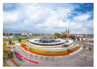
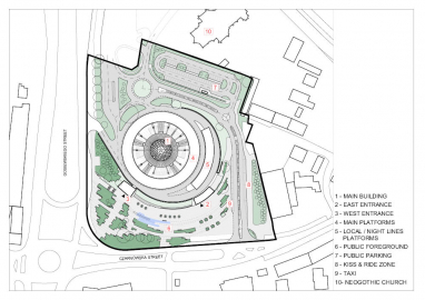
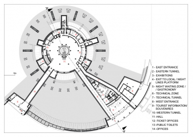
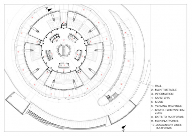
The Kielce bus station is a multi-dimensional facility. We were dealing with a patent-protected, innovative communication solution for a collision-free island station, where the traffic of vehicles is separated from pedestrian and its architecture is dominated by the related functional aspects. On the other hand it is a living testimony of its time.
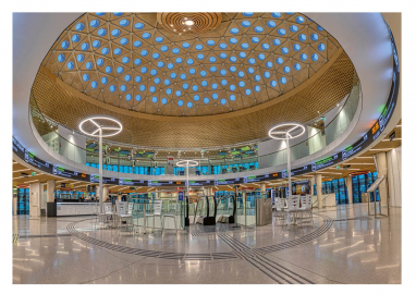
Designed in the 1960/70s in time of hard socialism. As for that period, it was packed with innovative technical solutions, which had aged during the 9 years of construction. Ultimately degraded by the freedom of the ‘economy’ of the 1990s, at the same time become a symbol of Kielce like the Eiffel Tower for Paris. The communication solution and the body of the building had to be protected first. Another important issue is the memory of the times - we really wanted to keep the characteristic design of the 1970s. But we had to adapt the station to new technical requirements and as well as to ensure accessibility for disabled people. We also had to eliminate functional compromises and put natural light into the building. But the most important thing has always been the emotional aspect - preserving the unique and hard-to-define atmosphere of this strange building.
To change everything without changing too much. To put daylight inside every level. To be energy efficient. To make it fully accessible to all (abled or disabled) people. To put there some more activities than only mass transportaiton. To bring this place to life again.
The priority was to preserve patent-protected, innovative communication solution for a collision-free island station, where the traffic of vehicles is separated from pedestrian - which were modeled on airport systems - originally designed by Mieczysław Kubala (ing.). This revolutionary idea was beginnig of whole story. Second point was to change, sometimes demolish but recreate its original and unique shape created originally by architect Edward Modrzejewski and Jerzy Radkiewicz (ing.). Third point was to make people feel good inside the station – to make good change of originally design interior by architect Andrzej Grabiwoda – as well outside of it. And besides of all above the renovated station had to be a modern example of the application of technical and utility solutions for this type of facilities.
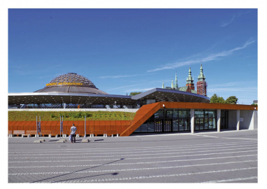
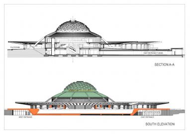
We were obliged to use a cooper cladding of the domes roofs - as the old station has and to interact with roofs of the nearby neogothic church.
We had to leave the same number of special skylights in a dome - we projected them with collaboration with the biggest polish producer of roof windows and were especially produced and only for this realization.
We’ve used as many original structure as we could, but we had to replace almost whole underground parts outside the main building (esp. tunnels).
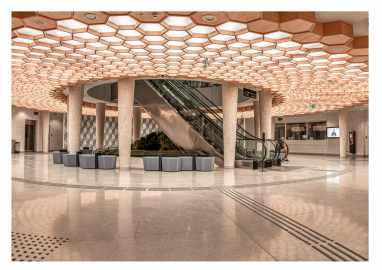
We changed every specialized installation in object and designed new. We projected moving stairs and elevators wich were absent earlier.
We took care of acoustics - you can finally understand the words.
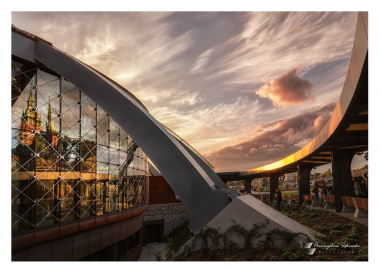
We designed, with producers, electrochromatic glazing with point mouting in structural facade - one of it's kind solution in Poland and perhaps in world (kind of mounting system in this kind of glazing).
We used special heating/cooling system for almoast whole building - installed inside floors.
In the facility, which before was completely inaccessible to disabled people, we designed many systems for various types of disabilities - now it is fully accessible to them (inside and outside).

