Oslo Main Library
The new Main Library in Oslo is an open and intriguing building in which you are constantly invited around the next corner, to discover and engage in all the activities the modern library has to offer. The main concept of the building is a system of interlocking diagonal atriums, light shafts, that connect the floors into a continuous vertical public space.
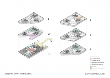
Located between Oslo Central Station and the Opera House, Deichman Bjørvika marks a new chapter in the 235-year history of the public libraries of Oslo. Stretching over six floors, the library offers an extensive media collection, together with informal reading- and working spaces, labs, workshops and studios, multipurpose hall, cinema, restaurant and administration facilities. The library and the two adjoining buildings create a vibrant, human scale urban project, in an area formerly occupied by highways and port activities. The three buildings have a common language in volumes and façade expression, to answer to the requirement if forming a unified backdrop to the opera building. The façade of the library combines environmental performance with the filtration of daylight and the distribution of different panoramic views, in a single unified façade structure.
The site is relatively small. To avoid too many floors, the building cantilevers out above its footprint: The first floor above the street to the east, and the fourth floor almost 20 meters out above the urban plaza to the west. This largest cantilever creates a generous covered entrance, still preserving the required line of sight to the neighboring Opera. Visitors are received by three equivalent entrances, facing different directions of the city. Three ‘light shafts’ cut diagonally through the building from each of the entrances, giving a glimpse into different sections of the library. The light shafts distribute daylight downwards from three big skylights in the roof, connecting the floors into a single open public space. Enclosed spaces and niches are organized around three free standing ‘book towers’, liberating the facades. This organization lets daylight in from all directions, and allows the uninterrupted movement around the cores – what will I discover around the next corner?
The strategy of the interior has been to balance permanent elements providing lasting qualities, with flexible elements to support a vivid and changing atmosphere. The roof has a characteristic folded geometry providing structural strength to the concrete, making the cantilever of 20 meters possible. The light shafts are framed by concrete railings. Together these concrete elements contribute to a characteristic atmosphere. Rooms and niches create arenas for temporal installations and exhibitions and has a rich variety of colors and atmospheres.
The facade combines high insulation value with even distribution of daylight. From 1st floor and up narrow insulated panels alternate with narrow glass panels. The diffused glass of the interior eases the impression of the closed panels, creating a soft and even interior light. In the corners of the building big windows provide panoramic views in different directions, lending variation and tension to the interior. The façade was a vital element in the goal of the client: to reduce the CO2 emissions by almost 70%.


