Kai 36
Kai 36 – 500 years revitalized.
Hotel and Café Bar in-between rock and river.
Graz/Austria
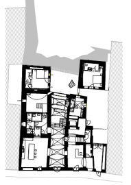
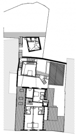
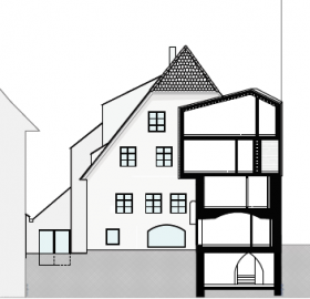
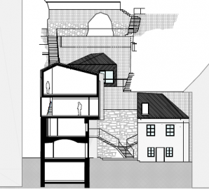
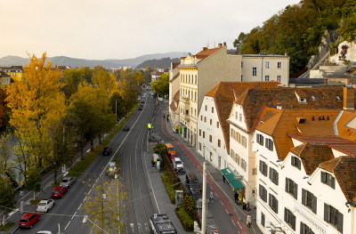
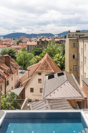
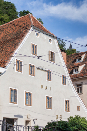
Located in the old city center of Graz, Austria’s 2nd city, right at the edge of the castle hill, this building was mentioned for the first time in 1596. The site includes two properties. One facing the street with the existing building and one in the back, which is terraced on to the Schlossberg (castlehill), which is a rock-hill with the old fort in the historic centre of Graz.
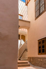
The flow of operations for the hotel and café bar as well as the flow of visitors through the house and the garden were fundamental for the planning of possible interstitial spaces, meeting spaces and communication spaces. The dialogue between inside and outside was an important requirement to show people the way from the street to the inside of the building.
Kai 36 is housing 163 original artworks from the client’s private collection such as photographs, paintings and sculptures.
The spatial experience of the ensemble is created from a grown and complex configuration of elements.
The aim of the project was to maintain the unique character of the facility, to restore what is worth to protect and creating something contemporary at the same time.
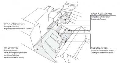
The idea for modification was shaped by looking at the different elements - like main house, new areas like the pool and outbuildings - individually and how to best bring them back together.
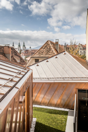
In contrast to the main house with its characteristic crested hipped gable, the roofs of the outbuildings were not worth to be protected. The removed roof areas as well as a terrace area were covered with new Y-roofs.
The new structures are clearly subordinated in terms of the scale of the existing main house and add themselves into the surrounding roof landscape through their sloping gable roofs.
The used materials wood, stone, copper, brass and glass were the natural result of the location in-between the rocks of the castle-hill and the river Mur.
To work in a resource-saving and more experimental way, remaining stock items of stone in different formats were purchased. The further design process was guided by the availability of materials. This led for example to different stone in the different bathrooms.
Furthermore, baseboards were used in an unconventional way, laid as pieces of the floor giving them a characterful pattern. To create different haptics, they were laid the right way and bottoms up.
The result is a variety of surfaces that provide a visual and tactile experience that moves away from the familiar, using limited resources in an innovative and new way.

 © Dietmar Reinbacher
 © Dietmar Reinbacher
 © Dietmar Reinbacher
 © Dietmar Reinbacher
 © Dietmar Reinbacher
