Health House Rainha Santa Isabel
Remodelling of the Bento Menni building, administrative building and Resurrection Church
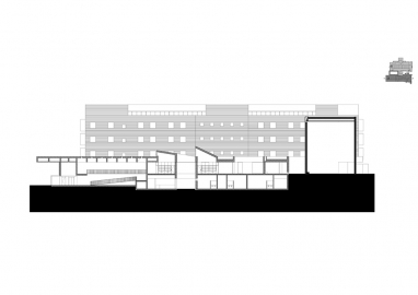
The Bento Menni building had a functional and spatial structure inadequate to the
requirements that a health-care unit must meet today, thus needing a profound change. The
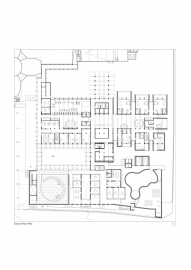
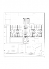
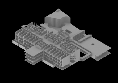
new program implied an increase in the building's implantation area, growing towards the east
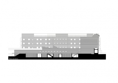
and increasing its depth, as well as adding a floor instead of the existing gable roof.
All exterior and interior walls were demolished and only the structural elements
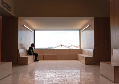
were kept. The spatial reorganization revolved around providing generous and luminous
circulation spaces of variable dimensions that allow the creation of informal living rooms,
transmitting greater comfort and dynamism to the spaces, in contrast to the usual coldness of
circulation spaces of other health care units.
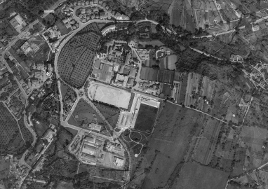
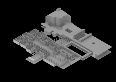
Integrated in a large complex of the Casa de Saúde das Irmãs Hospitaleiras de Condeixa, we
proposed a set of three functionally autonomous buildings that seek a formal unit - a rocky
massif, an artificial mountain - that demands urban and symbolic representativeness, which did not exist before. By clarifying the relationship with the rest of the group, the solution revaluates the centrality of the pre-existing church.
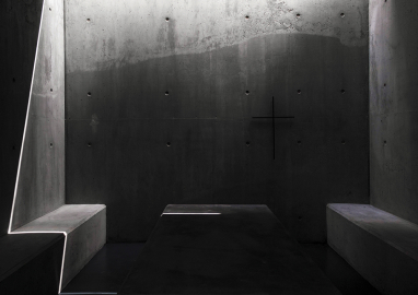
In the new Administrative and Reception Building, which connects with the health unit, the
mortuary chapels and the chapel, are also located the support areas for employees.
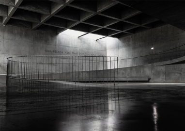
The route of these three formal units was designed as a promenade architecturale, starting at
the outer reception square that ends on the roof of the Bento Menni building
In this project we intended to develop the density and weight of a program and its volumetry through the vibration of light on the surface that stereotomy allows.
The presence of the structural elements in this project were essential in its design. Pillars, beams, and slabs of the existing building were maintained, and the beams and pillars are present in the common and social areas, marking an essential rhythm and cadence in their composition. It was the presence of the structure as the central compositional element of this project that allowed the connection and integration of such different volumes and functions. New structural elements are in exposed concrete, and their presence is evident in the in contact with the ground.
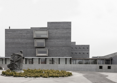
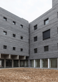
The density of the programme and its volumetric consequence made us want to accentuate it, which is why we chose a stone cladding. In Casa de Saúde already exist a granite building, so the stone chosen was granite, but a blue one, for the plastic possibilities it presents, namely with the light throughout the day and the rain. The stone was cut in longitudinal pieces of 100cm to 150cm and 5,7 and 11 cm high by 11 cm thick. These measures were defined by the required windows and doors and in turn they redefined them. Their thickness was marked on the window and door jambs, as is traditionally done in stone construction.

 © Maria Bicker
 © Rita Caniceiro
 © Rita Caniceiro
 © Rita Caniceiro
 © Rita Caniceiro
