Royal Museum of Fine Arts Antwerp
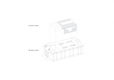
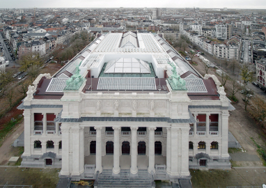
A thorough renovation and a contemporary extension bring back the grandeur to Antwerp's Royal Museum of Fine Arts. A new autonomous museum rises within the four original patios of the 19th-century neoclassical landmark invisible from the outside. These contrasting yet dialoguing spaces coexist as two different worlds in one building.
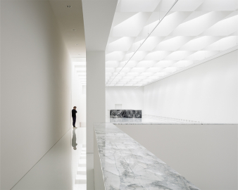
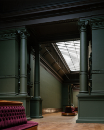
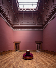
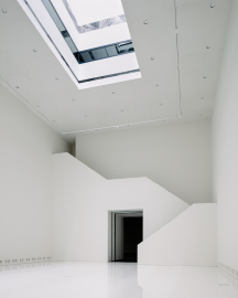
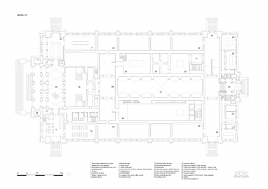
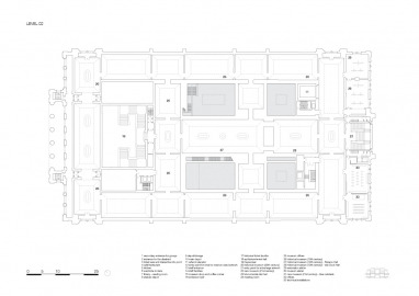
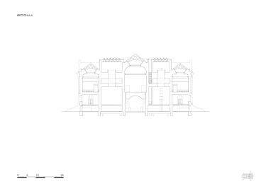
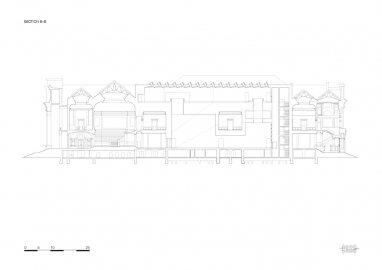
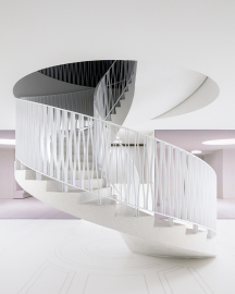
The museum's layout is divided into a public entrance area, central exhibition spaces, and back offices. Coming through the foyer into the Keyzerzaal, visitors can opt for one of the two different routes through the building – following the grand staircase up towards the renovated 19th-century museum or heading straight towards the new wing. In the historical museum, an enfilade of colourful halls lit by wide glass canopies exhibits the collection's highlights. Meanwhile, the new 21st-century museum rises as a completely autonomous entity amid the structure built within the four original patios. With bright white exhibition halls, hidden rooms, long staircases, and far-reaching sightlines, the new museum charts a route full of surprising vertical experiences.
The latest intervention aims to reverse previous spatial changes made to the museum throughout the 20th century. Combining a thorough renovation of the historical museum with a contemporary extension concealed within the existing structure highlights the heritage value and the resilience of the impressive neoclassical building. The new architectural concept of KMSKA is an adventurous journey where visitors explore the two contrasting and dialoguing museums sharing the ability to unveil themselves little by little. Original colours, materials, and routing are reinstated in the 19th-century exhibition halls, while a sequence of vertical spaces in the 21st-century museum is created by dematerializing the visitor's experience. The two realms could not be more different and intense, yet the extension coexists with the powerful historical structure without denying its monumental character. The visitor experience is never predictable and always in balance. Both routes are challenging and at the service of the art.
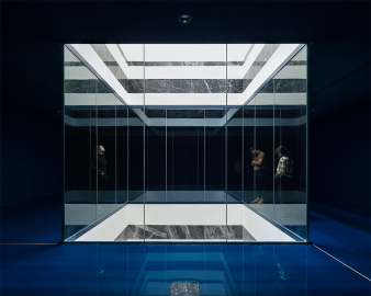
Materiality reflects and reinforces the juxtaposition of the historical and the modern. Restored oak doors, tall columns, ceiling ornaments, and bright colors bring back the ancient grandeur and contrast with the new museum's bright white halls. Daylight floods the extension through triangular north-facing roof elements and four large lightwells bouncing off the high-gloss floors for an overall dazzling effect. Wherever the new extension 'cuts' the building's solid mass, subtle marble inlays have been added, echoing the elegant 19th-century museum's materiality. Museum's solid mass with walls up to 70cm thickness make the thermal mass used to stabilize the inner climate, while the abundance of natural light reduces the need for artificial lighting. Additionally, a low volume ventilation system is discreetly implemented and requires 30% less air than a conventional full room climatization, resulting in fewer air ducts and energy use.

