Art 1 Offices
An existing 40 year old office building is stripped back to its structure and completely reimagined for the present.
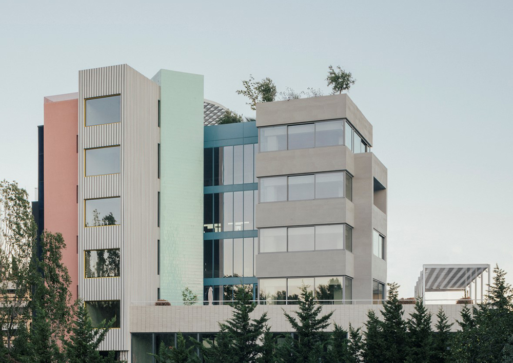
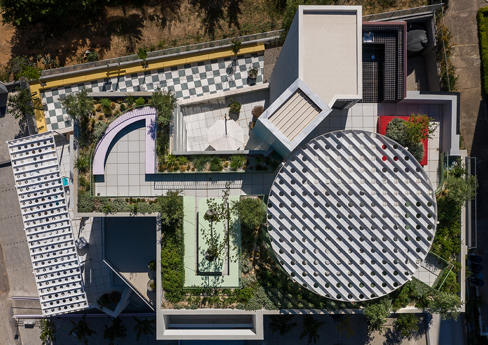
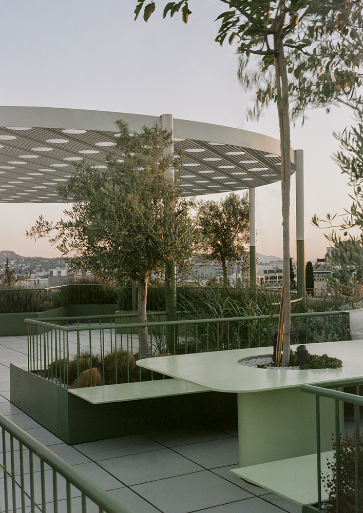
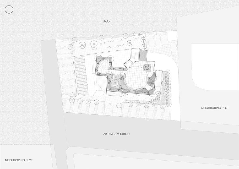
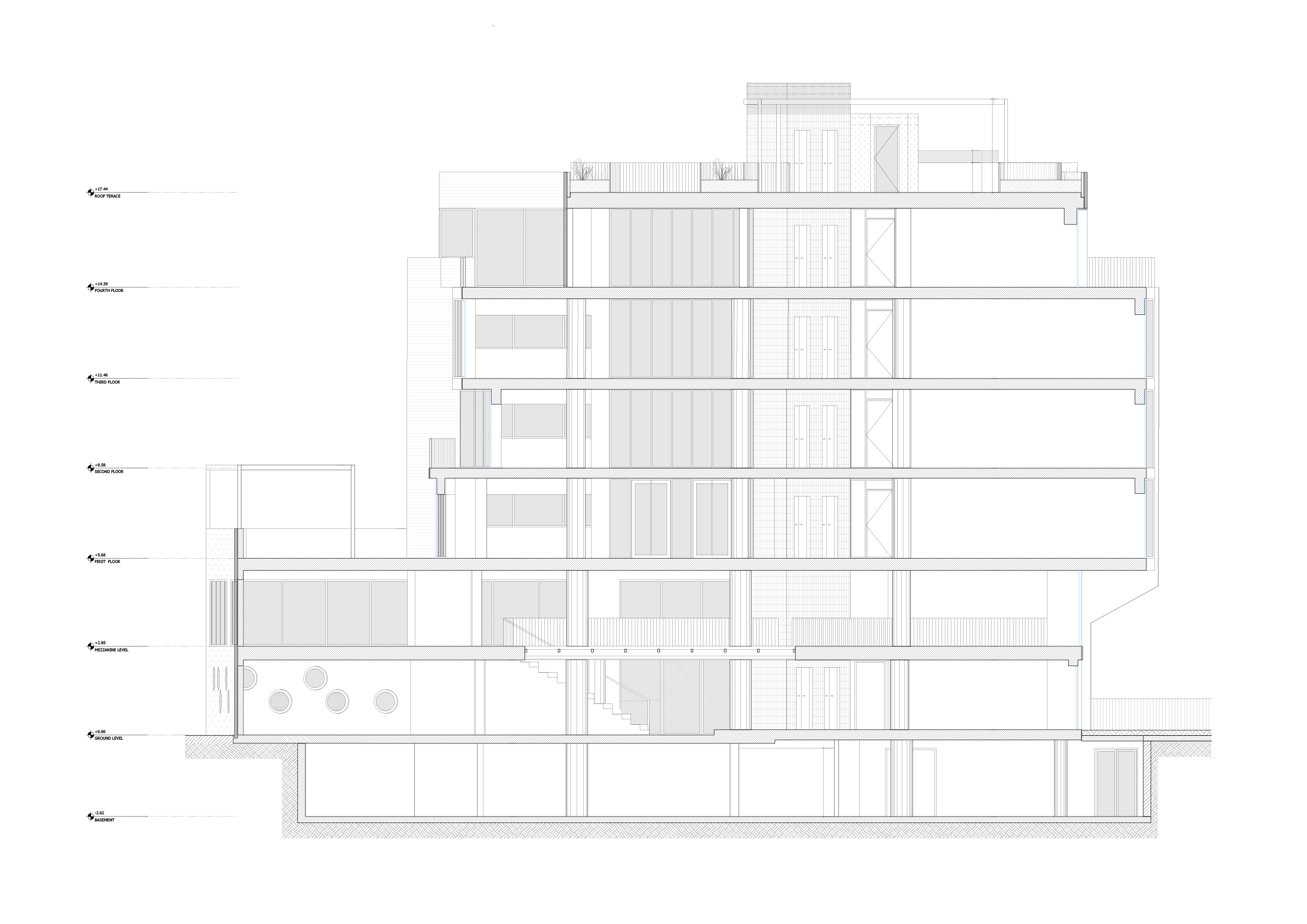
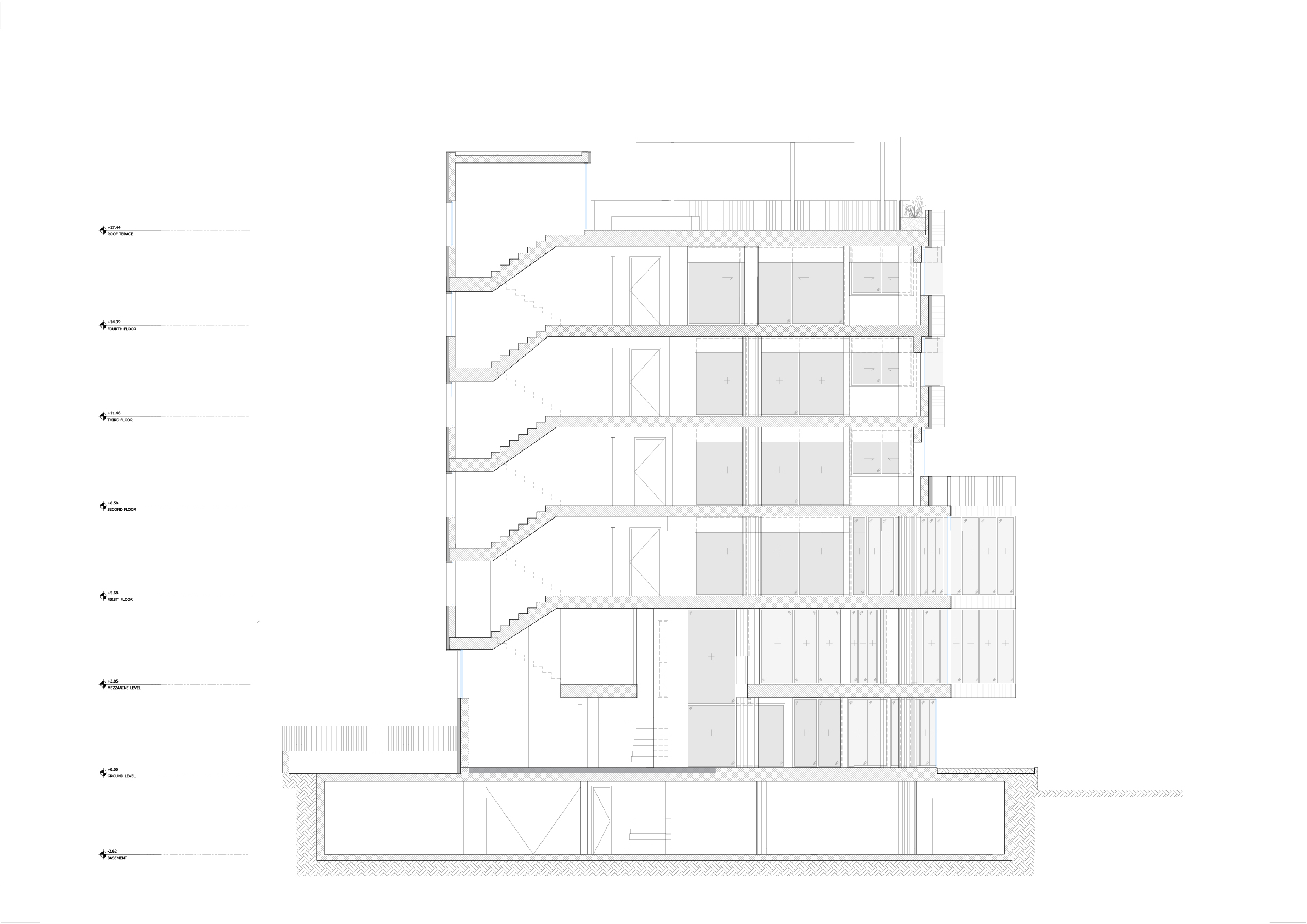
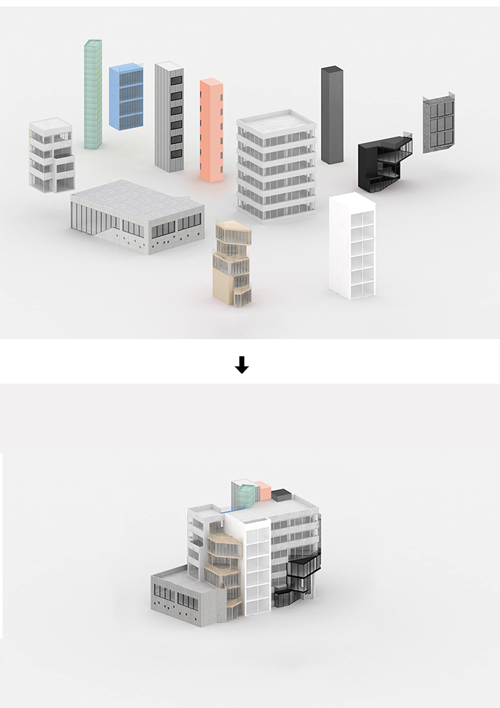
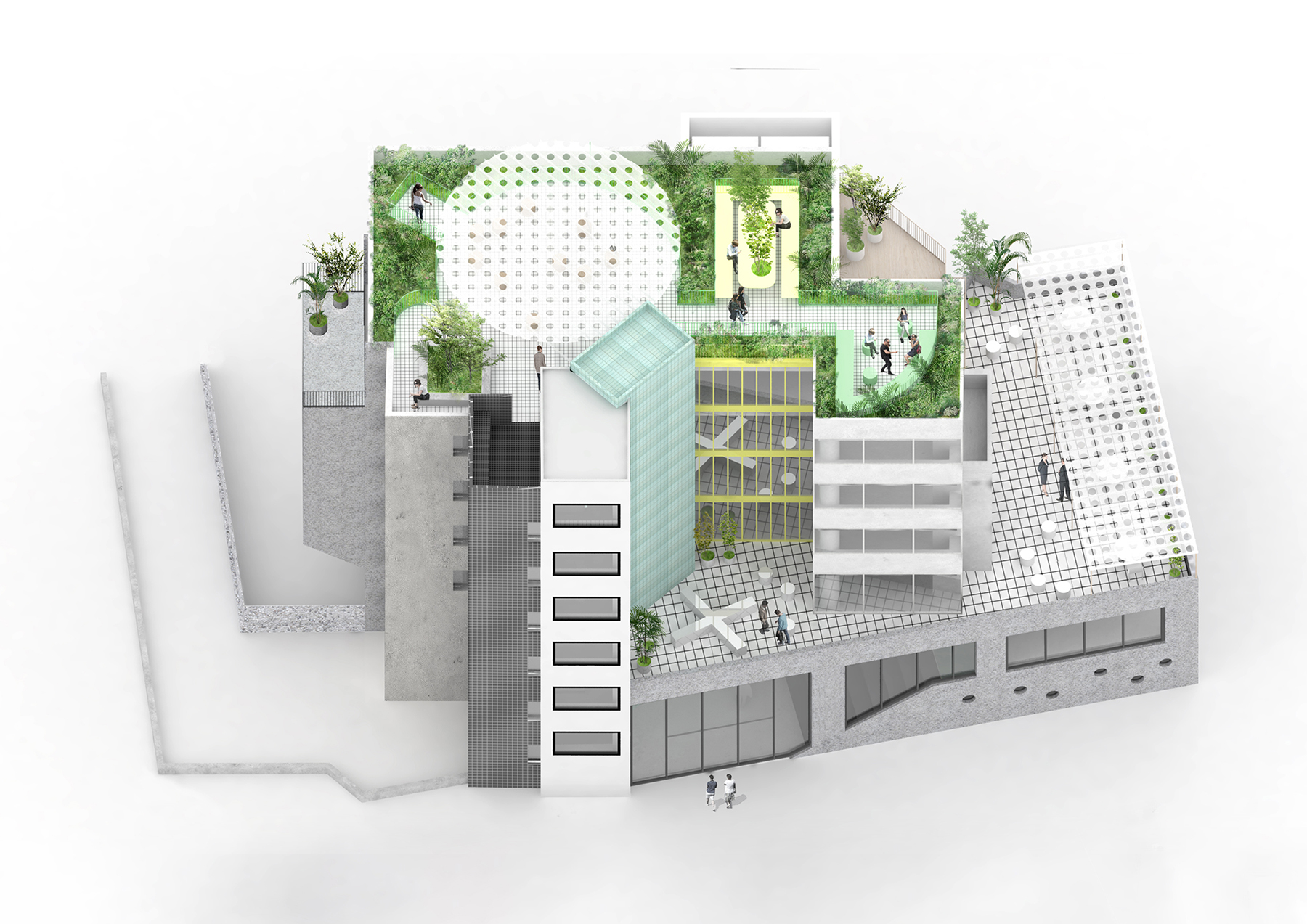
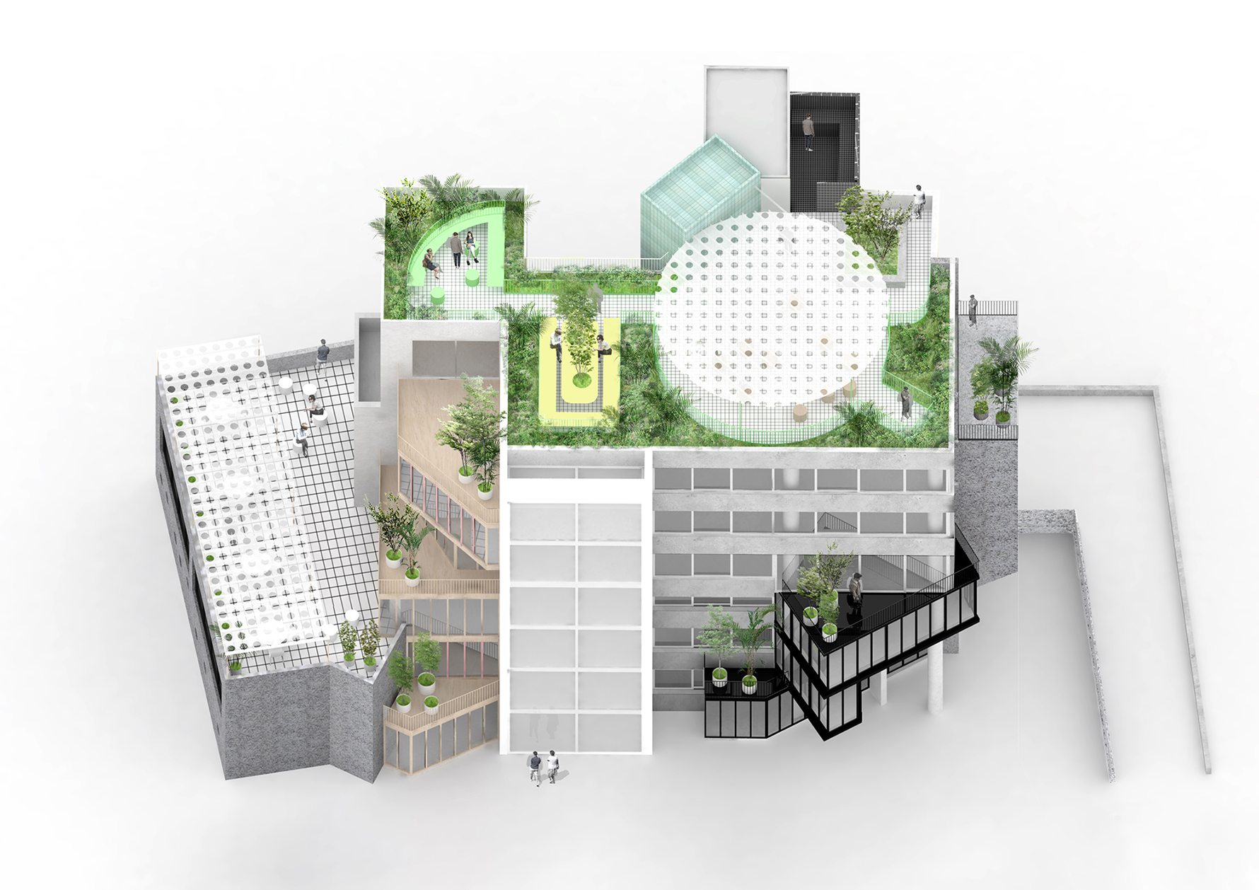
What used to be a confusing and run-down muddle of geometric clashes is now untangled and rearticulated as if the building is composed of twelve separate buildings, each with its own cladding logic and interior atmosphere. The building is reoriented to take advantage of its location adjacent to a natural park, with new large openings cut into the existing solid walls to open up views but also to bring in more natural light and compensate for the low existing ceilings of the building. A green roof and circular pergola crown the top of the building, offering smaller outdoor shaded working spaces as well as a bar and a large event space that encourage new forms of exchange and dialogue. The building incorporates a range of sustainability strategies – reuse of all structural concrete and interior marble finishes, high performance insulation and windows, the use of locally sourced and natural materials, low energy MEP systems, natural water retention, green roofs, charging stations and bike parking, and integrated photovoltaic panels - and achieves the local A+ highest energy efficiency grade.
Building regulations didn't permit any area to be added, and the economics of the project didn't allow for any space to be removed. So the design challenge became how to make sense of the existing geometry, and attempt to rationalize it towards something beautiful and functional. Most developers would have given up on this particular existing building. It was ugly, run down, and crumbling. It was uninsulated, with very low ceilings, inefficient floor plans, confusing internal circulation, and almost no views to the adjacent park. It needed seismic reinforcement.
Original thinking was needed to simply imagine an alternate future to demolition. The priority was always to reuse as much of the original building as possible in order to test the limits of a commercial office re-use/renovation project. If we could economically renovate this building into something attractive, functional, energy efficient, and financially viable, then we would prove that it could be achieved with just about any building. Anne Lacaton’s statement, “never demolish, always transform” was put to the test. Transforming this mess into something worthwhile was itself an act of innovation.
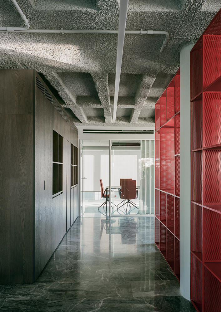
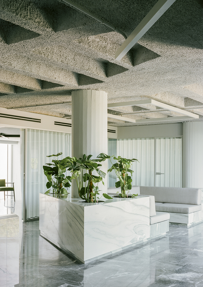
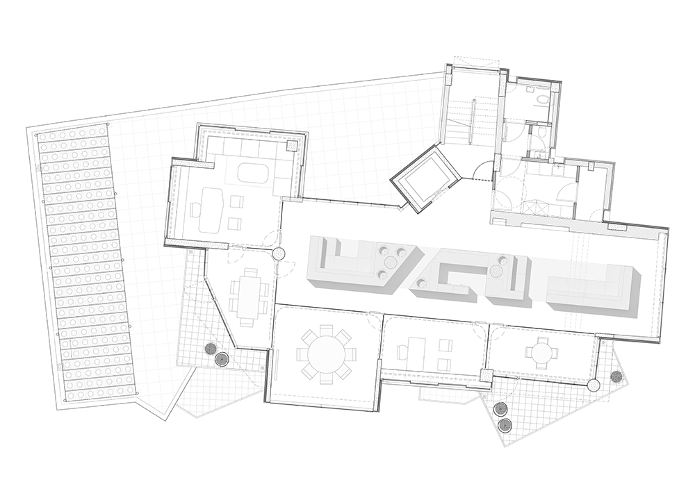
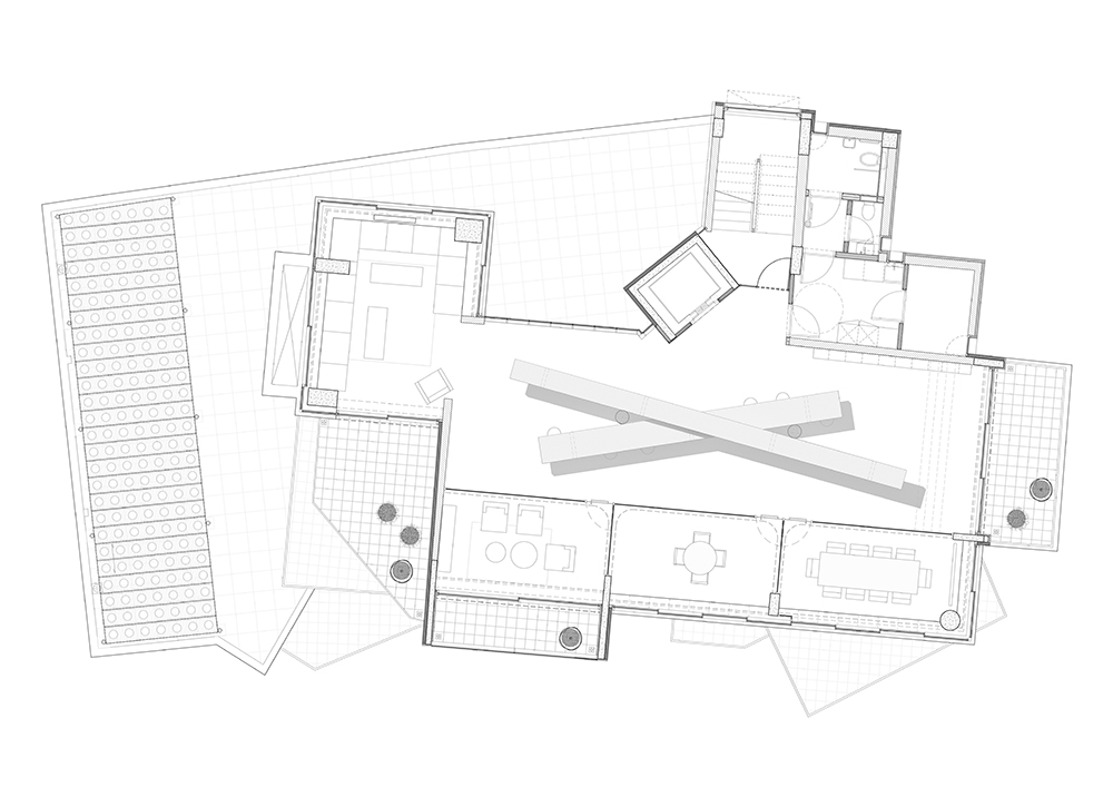
At the front, the building adopts a more subdued material expression, with subtle colour variations of white, grey, black, and gold. A new curtain wall that covers the tallest front volume is coupled with generous cast-in-place terrazzo steps, marking the front entrance. At the rear, the colour palette become more playful. The elevator volume is clad in turquoise tiles, the staircase volume is painted in B&W stripes with bright yellow windows, while the office spaces are clad in blue metal panels. On the interior, the existing black marble flooring of the building is restored while ceilings have been stripped back to expose the original irregular concrete formwork. This combination of refined and rough materials creates a balance and a common DNA across all floors, letting the custom furniture on each level create its unique identity. This ranges from three large marble seating objects on one floor, to a bright red perforated metal library on another, and to two large criss-crossing hotdesking tables on a third. On the ground floor, a spacious red terrazzo stair that also functions as an amphitheatre for events and projections connects to a light-filled mezzanine level.