Monochrome Apartment
A radical answer to a limited budget renewal of an ordinary beach apartment. A unique action – a carefully chosen warm blue covers every single element. This creates a monochrome experience, an intense atmosphere, a sense of unreality that slows down the breathing and allows one to discover the moment. A single body that envelops and soothes one.

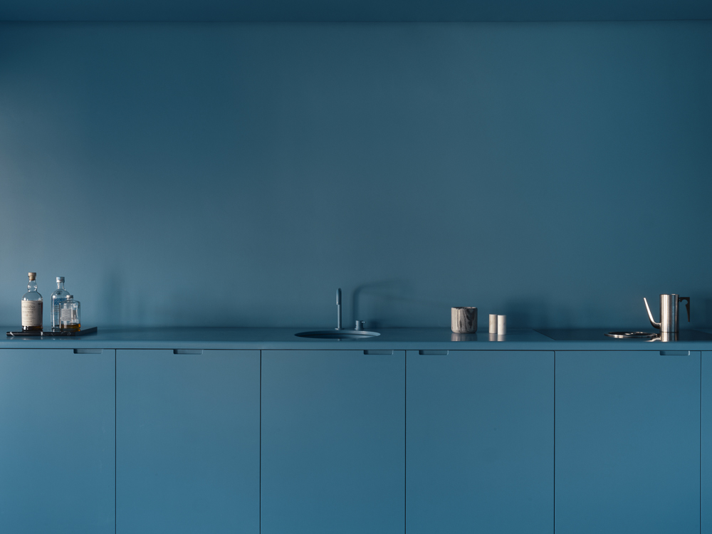

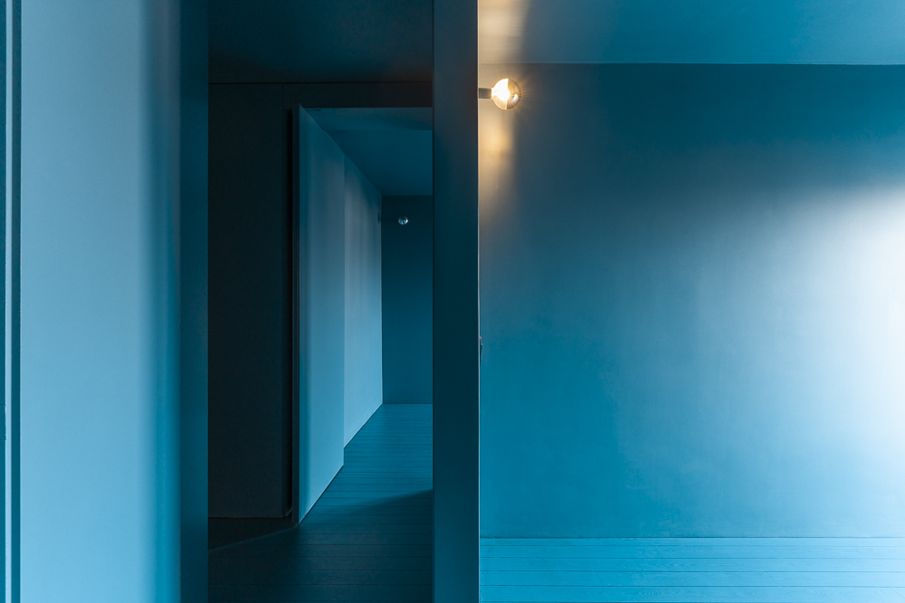
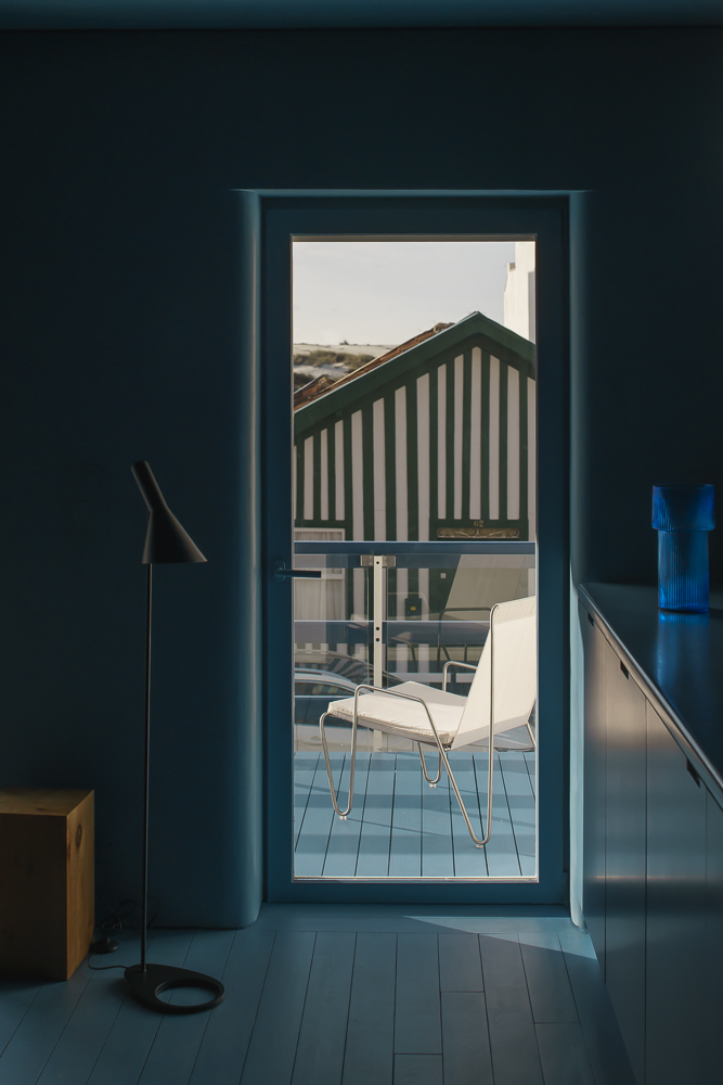

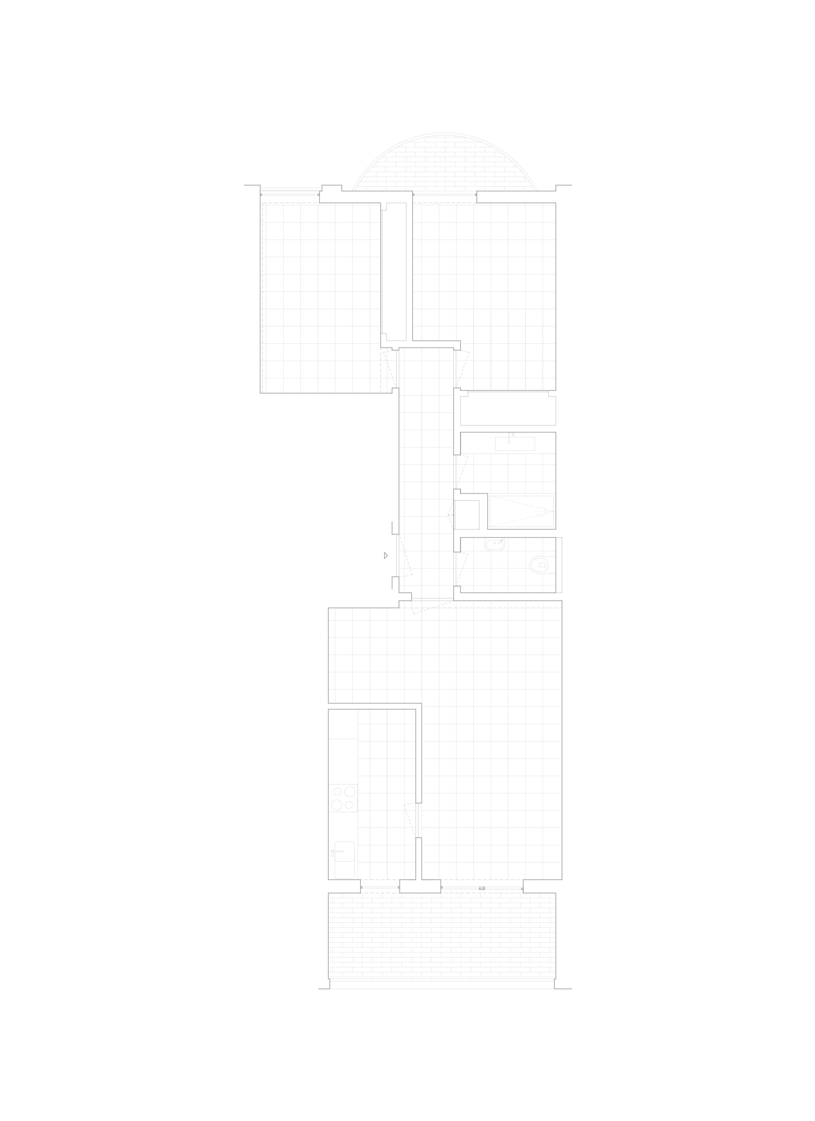

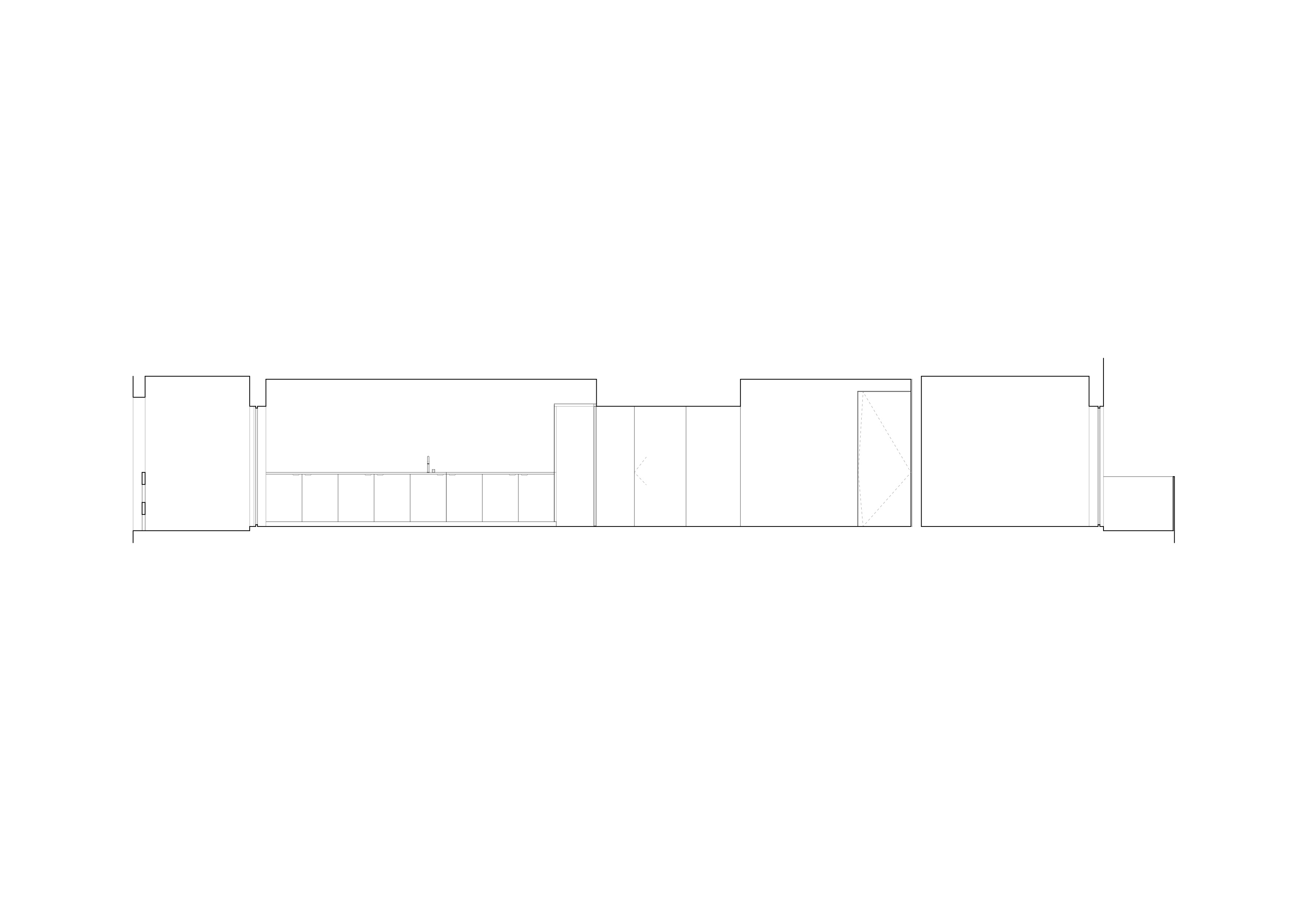
The traditional wooden houses of the region painted in bold colours, the ocean, the lagoon, and the sky reflected in the mirroring waters gave us the leitmotif. The limited budget for the renovation of this beach apartment gave rise to a radical answer: one single colour for the whole space, for all architectural elements, creates a sense of unreality that slows us down. As one moves through the house, the attention paid to the contours becomes noticeable, allowing the light to flow softly through the space, leading us to a feeling of harmony. The program is divided clearly in the core, separating the private zones and the social open area. A low height corridor with moving panels allows for different uses, simultaneously. A long worktop, where one can cook, unifies the social area leading us to the balcony with its view of the dunes. The monochrome is like a backdrop that highlights life.
Despite of the limited financial resources, the pre-existence space conformation and the limited possible materials to use, we didn’t gave up to make this small retreat a remarkable experience. The monochrome experience detaches us form the daily routine giving us a space to the new. That is only possible with the radicalism of no other colours or materials, all the elements are painted in this carefully chosen warm blue, that can remind us of the waters experiences in ocean or in the lagoon around, connecting us with the territory. The use of color gave us a powerful possibility of expression, matching the client’s budget. At the same time, it creates an intense character to the space. A character that we intensified with the only left architectural tool: shaping the elements, the contours, the edges, of the walls, doors, counter, etc. This carefully designed feature allows the light to flow softly through the space, leading us to feel more the variation of day and the seasons outside. At the same time, it intensifies the feeling of harmony, establishing consistency and solidity for those living in the apartment; the sense of peaceful unity and silence.
The choice of using ink to cover opened the possibility to use low budget raw recycled materials, such as recycling wood composite panels for the carpentries, or plasterboard with recycled content of almost 100%.The ink is entirely water based and the emulsion paints are classed as Trace VOC (Volatile Organic Compounds) which is the lowest rating currently possible. Adding to this we used natural solid pine wood from sustainable forests for the floor, using a tint oil to feel the wood and some cork for sound proofing insulations.
The monochrome experience starts as one enters in the middle of a corridor that both connects and separates the social area and the private zones. The low height part of the corridor covers two different height existing beams and articulates the two different programs expanding the space in the direction of the two facades. The structure was maintained intact; we removed the walls that were separating the old kitchen and the living room and the small pieces of walls around the doors and openings. A mirror in the top of the line of the cabinets and a round one in the end of the corridor create a spacial continuity that give complexity and expand the space.