Møntergården Museum
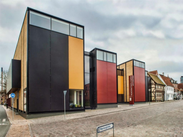
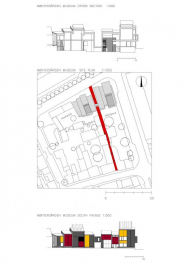
The new museum has been neatly set in, as if a pair of pincers, on a particular urban sensitivity and uniqueness. Groups of houses and yards from the Renaissance, 17th-, 18th-, 19th- and 20th-century houses, and the mediaeval Møntestræde form the setting for the new building as en example of how it is possible to blend modern architecture into a sensitive urban historical context while still appearing as a distinctive museum building in its own right.
The main task was to think mindfully along specific cognitive paths, as it were, in order to design a new set of buildings able to deliver the required functions-while also entering into a dialogue with the locality and the heritage aspect playing with the haphazard yards, and the special atmosphere surrounding backyards and historic houses.
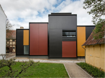
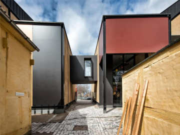
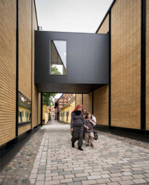
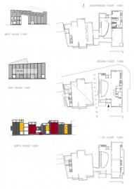
The proposal, therefore, is a building embracing the mediaeval narrow street Møntestræde along with its magic - transmiting a compact, but forceful signal. Longhouses allowing small-scale movements and turns, creating links to the inestimable historic buildings and forming a gradual transition to the smaller scale-but in an extended time capsule. The choice of materials is a trifle surprising, but wholly natural, and juxtaposed in an unusual way. The choice of materials and colors reveals a profound appreciation for the surroundings. A heritage , which is immediatly decipherable, because the relatively few materials used for the timber-framed buildings and their constructions, can be seen directly. This priciple has been extended to the museum s seven longhouses, which are held in position by black iron frames using local bricks stacked on top of one another in even rows as infill, referring to the brickwork in the neighboring timber-framed buildings not being load bearing, but merely used as infill.On the other hand, the wall ends of the seven longhouses are clad with large steel plates painted in the three colors: black, red and ochre that represent soot, blood and soil hence underligning the historical aspect of this museum.
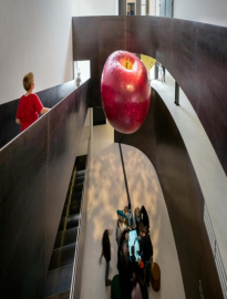
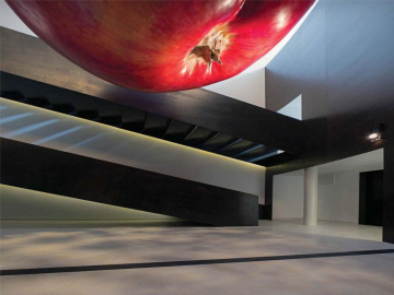
On the architectural effects used in relation to adapting the new building, is to use materials whose texture can be experienced very directly in the finished facade. The steel, which appears with distinct production tracks, seen through the paint. Paint with clear brush marks. Clay with traces of formation in soft clay. Just as important has been used very few materials:iron, brick and glass.Inside the building, the heavy look from the outside is lightened by lacquered plating, polished floors and plaster ceilings and, gradually, the exhibition itself becomes the focal point. The visitor s promenade inside the museum bring them from the entrance foyer with a curved tripel high space formed in iron,as the heart of the building, through a slow iron staircase to a bridge over Møntestræde and there, the exhibion starts.
The building s setting is very sensitive among the historic buildings, that s why any kind of instalation on the roof as for example solar panels, was not possible. Sustainability is based in a very high isolated building with very few windows and the use, when possible, of local materials as clay for the bricks.
The building is 2.500 m2 and the site 1.930 m2

