Serlachius Museum Gösta Pavilion
The project was selected among 579 entries in a large open international competition, because of the way the Museum sets up an expressive and harmonic dialogue with the existing Joenniemi Manor and the natural surroundings, completing a whole experience by introducing an emotional journey through light, views in alternation with art.
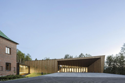
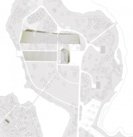
The site is understood as a large green plateau where the monolithic figure of the Joenniemi Manor House stands imposingly at its highest point. The strategy establishes a dialogue between the new and the existing by positioning the new construction so that Joenniemi continues to take centre stage, and at the same time the new museum does not lose the opportunity to express its character and contemporary presence.
This project represents one of the first examples of large-scale public buildings in Finland to have been built with structures, external walls and finishes with local wood, in a very subtle way.
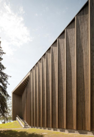
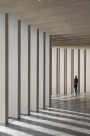
The project is conceptualized as a dense abstract forest, translated into a series of parallel wooden frames that define its geometry, structure, texture and transversal permeability. The challenge was to formalize a representative building, five times bigger than the existing one, without threatening the presence of the House.
The idea was to bring the exterior spatial quality inside the new building by extending the entry plaza through a porch that blends outside with inside. The new building is organized by a spacious foyer, placed strategically as the heart of the building connecting the whole program with Joenniemi Manor.
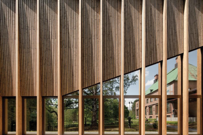
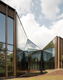
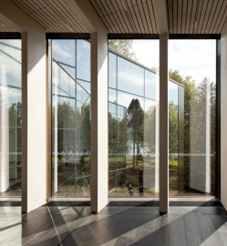
Visual continuity between outside and inside was one of the main goals, so landscape is introduced into the main building body through some incisions. Those incisions or interruptions reduced the visual impact of a building in such a sensitive environment by fragmenting it into smaller volumes. They are irregularly shaped, covered with a reflective glass surface that promotes the perception of infinite mirrors; doors or forest walkways optically subdividing transversely the building.
The incisions in the interior volume provoke a sudden and surprising invasion of light with impressive glimpses of exterior views. These invasions transform what would have been a lineal path into an emotional one, allowing external spaces to penetrate inside the building.
Outside, the building presents a series of vertical uprights that follow and emphasize the rhythm of the interior structure. Between the uprights a ventilated facade system was designed of spruce wood strips twisted independently to the tectonic limit of the material itself, thereby achieving an effect of a three-dimensional texture that varies along the entire elevation.
The frame structure was also designed to give greater flexibility to the interior exhibitions layout. Supports have been left at the ends thus freeing up the whole space as an open plan.
Although the Foundation had plenty of resources for the final construction, from the beginning the economic criteria were set up, we were busy to constrain the budget in order to build a modest construction without losing the high architectural quality standards with a very contemporary tectonic language.
The structural framework is constructed with laminated spruce wood as it is abundant in the area and in turn makes an historical reference about the local industry. It represents the biggest cultural building made out of wood as a coherent experiment and traditional tectonic solution, taking advantage of local materials and specialized industry.

