ATRIUM Furniture Department Store
Offering transparency
The Atrium furniture department store stands on the periphery of Petralka, the largest pre-cast slab housing estate in Slovakia, between the motorway and the railway line.
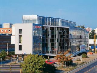
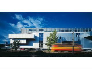
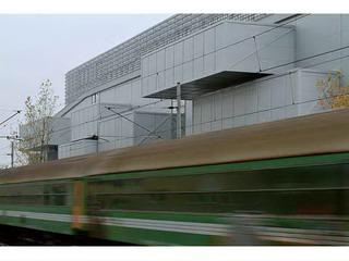
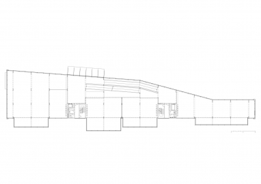
Although geographically close to the historic core of Bratislava, Petralka is separated from it by an entire series of barriers: the Danube with its unwelcoming shore line, the lack of bridges, the present-day Janko Krá?s Park, the four-lane approach road to the motorway and finally the railway line connecting Slovakia with Austria and other countries. The ambivalent peripheral nature of the surroundings has determined to a considerable extent both the placing and the form of the furniture store. The building is reminiscent of a prism set in motion by the chaotic situation around it. The break lines indicate captured movement. And the way the building touches the ground strengthens the impression that it stands here only to rest for a while. In this gesture one feels the awareness of its temporary character, the unclarified local situation and a reaction to it. The building has two faces: one opens onto the road and conveys the impression of a town building. Although it has no display windows per se its completely glass facade, does imitate the natural gesture of a department store, as it reveals what you can buy inside. At the same time the curvature of the facade offers passers-by more than just an orthogonal view inside.
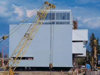
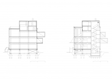
The other face directed to the railway line is almost entirely closed, interrupted only by cantilevering boxes.
Although from the description so far it may seem that the dynamic form of the building was influenced entirely by external circumstances, it should also be said that spatial considerations played an equally important role in the interior.
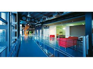
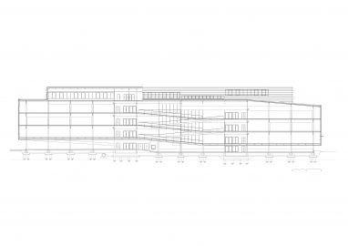
The inside is more or less a single continuous space that is accessed by a ramp leading from the ground floor to the last shop on the top floor. From the large space the individual furniture shops extend in different shapes and sizes into the vaults and curves. This spatial programme is a familiar concept often used in museums or art galleries in which the aim is to give visitors an overview, even when they enter individual thematic areas.
The volume appears to expand under the pressure of its mass of contents the front facade in the form of one large curve, the rear facade with its projecting boxes that are like open drawers. The boxes were justified in terms of providing additional retail area without the necessity of increasing the ground area occupied by the building. The building was erected in the simple manner typical of industrial premises.
Standardised surface treatments complement the exposed steel structure. The materials used in the interior are modest and inexpensive: concrete, epoxide flooring, metal section ceilings, steel planks with glass panels.
Transparency is a primary attribute of the furniture department store. This is not a question of allowing light through or providing views through the building. Indeed one cannot look through the building. The transparency lies in the possibility of looking inside and grasping its entire internal life at one glance. The solid rear facade as a stable backstage area against which the actions of displaying and selling furniture are organised. Thanks to its transparency the furniture store recalls a giant dolls house.
Henrieta H. Moravcikova
Architektur.aktuell, 1-2.2004

