top! Store
The building for the store top! was the result for a client interested in good architecture. An architectural competition was organized and as result, due to the close interaction between the client and the Architect, a suitable result for both sides was obtained.
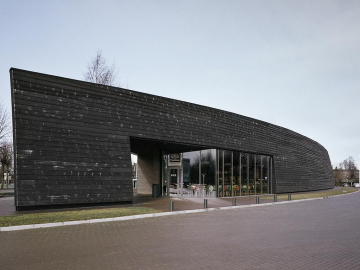
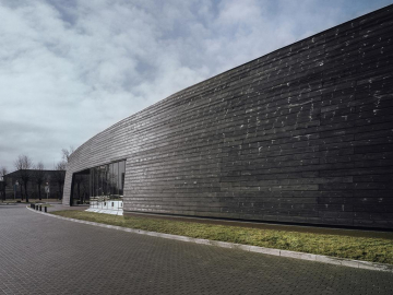
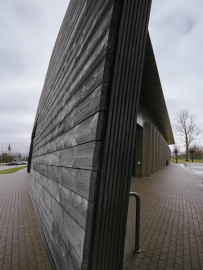
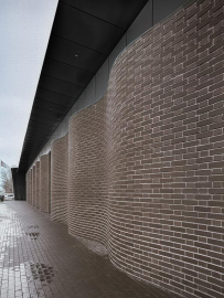
The building is created for two scales of perception towards the VIA Baltica highway it is designed as a linear volume to be perceived while in movement. Its form and wooden facade reminds Salacgrivas historical ship crafting tradition. On the other side, facing Riga Street and the pedestrian walkway, a smaller scale facade is designed which plastically flows into the public space and is close to pedestrians scale of perception. A new interior conception and colour principles were designed to improve the style of the grocery store chain.
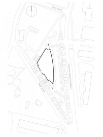
The site is located in the central part of Salacgriva historically the city council was located close to it, but it burned down in 1995. Nowadays, in its surroundings many public functions are located the church, the museum, a tourism info centre, the post office, the national park administrative building and a youth initiative centre as well as multi-storey residential buildings. Therefore, the site has been crossed with two highly used pedestrian roads. These facts defined the priorities of the project the site utilities are organized preserving the existing pedestrian flows and adding some attraction points for locals, for example at the both sides of the big building overhangs were created to protect pedestrians from rainfall and an attractive urban space was added as well as the paving relief at the backside of the building allows some urban sports or passive entertainment during very hot days.
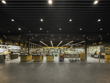
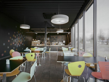
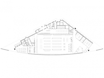
There are two main entrances in the building the northern one leads to a grocery store and some smaller shops and public restrooms, while the southern one leads to the entrance to a café. The interior finishing materials have been chosen to create the visual continuation of the exterior. The floor tiles are in a similar texture and tone as the clinker cobblestone surrounding the building. The ceiling lamellas are the same as in the overhang sector. A new interior conception and color principles are created. The selected dark grey surface bring the space and its details to the background remarking the items for sale in the foreground. There are only few accents in the grocery chains brand color, for example the yellow is used to navigate the customers through the store and in some images creating a pleasing atmosphere.
As far as possible the local building materials and design elements were used in the building, starting from the clay in the façade bricks and pavement cobblestone and ending with the furniture and lightning in the café. The technical systems sustainability plays an important role, for example the returning air of the bakery exhaust is used to heat the commerce hall.
Building area 1555 m2
Site area 6989 m2

