Seville Public Library
The choice location of the parcel, between the María Luisa Park and the Guadalquivir River, was the starting point of the proposal. In this gardened zone, the library inserts itself into the structure of the 1929 Ibero-American Exposition.
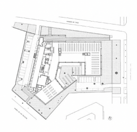
Isolated and singular, the new construction adapts to the geometry of the parcel and faces what were once upon a time the pavilions of Perú, Uruguay and the United States. Its façades provide partial answers to the different urban conditions of the perimeter, but also generate the building’s own entity. The gaps that are formed between built elements and the premises suggest alternative pedestrian routes and decentralized parking, without prejudice to the small scale of these free spaces.
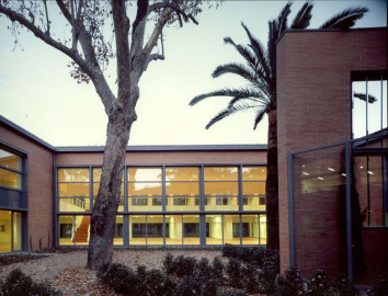
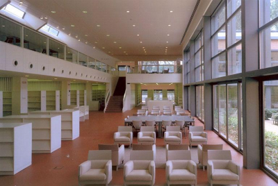
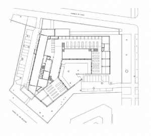
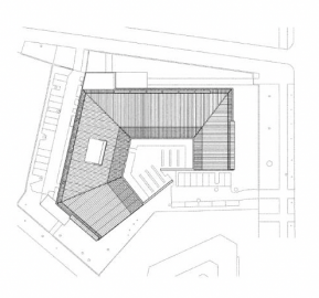
An irregularly contoured bay of large dimensions nestles into the lot to appropriate a chunk of the surrounding garden. The reading rooms and book collections are accommodated in an uninterrupted space that benefits from double illumination and simultaneous views of the courtyard and garden through opposite facades. The courtyard is the unexpected empty heart of this big house in the middle of a park, and welcomes readers most of the year, thanks to Seville’s privileged climate. The most characteristic free space of Andalusian architecture is the origin here of a twist that articulates the different parts of the project. Whether roof, shelf, interior staircase or garden hedge, nothing escapes the centripetal force of this hollow heart. The two accesses from opposite streets tauten this circular movement in the bay that runs parallel to the Uruguayan Pavilion. Along the linear foyer that connects them, a band groups all server spaces together and, like a filter, delays the appearance of the courtyard. The various study areas, which have direct access to the books, are arranged on two levels. The latter share the double-height space that users find themselves in after going through the index cards and the information and control desks.
-
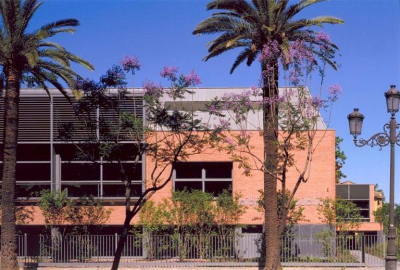
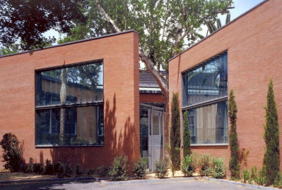
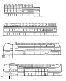
Echoing its context, the library is closed off with walls of red brick that evoke the old constructions of the Ibero-American Exposition. Large windows with metal frames bring in just the right amount and quality of light needed for white-walled interiors. Louvers over them, as well as the lush vegetation that is a prolongation of the neighboring park, prevent the excessive sunning of a pavilion that uses its relationship with the environment to foster the pleasure of reading.

.jpg)

 © Cruz y Ortiz
 © Cruz y Ortiz
 © Cruz y Ortiz
 © Cruz y Ortiz